Akram Adjab• 380
@akramAdjab
Posted
Hello Kolade 🙋🏻♂️, Congrats on completing this challenge
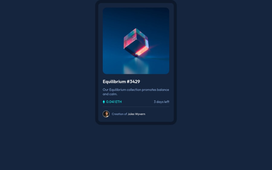
I checked your solutions and I found small mistakes:
- The
bodyelement should have thebackground colorand not thecontainerelement - To align the card vertically at the center,
min-height: 100vhmust be added to thebodyelement usingalign-items: center - When
justify-content: centeris specified there is no need to addmargin-(right, left): auto - Try reducing
font sizeinmedia query
I hope my feedback was helpful 🙌🏻
0
Kolade Olukoya• 20
@kolexstrings
Posted
@akramAdjab Thank you very much for your feedback, I will implement these changes 🙏
0

