@ExileurtSubmitted about 2 years ago
I thinks the code is "ok".. Any tips ?

I thinks the code is "ok".. Any tips ?
Hi, @Exiluert 👋. Congratulations on completing this challenge, you did a nice job. You could got one suggestion:
<div class="card"></div> should be wrapped in a <main></main> tag, for easy recognition by any web browser, it stands out as the main content of the web page or just rename the div to main.Great Job once again @Exiluert
Happy Coding
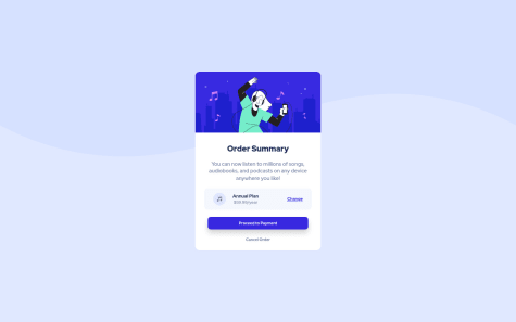
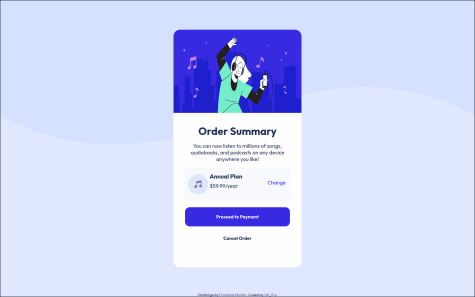
That's the first proposition. What do you think about it ?
Hi @Valeryio 👋. You've done quite well on this one, good job. Maybe this few suggestions might be of help:
.card won't survive much with the kinda width property applied to it, you should check out how to make use of these max-width and min-width from this resource https://www.freecodecamp.org/news/css-properties-examples/display: flex; property, it saves you some more lines of code and excess margins.plan{
display: flex;
justify-content: space-between;
align-items: center;
}
While you make the html markup work like this:
<div class="plan">
       <img src="" alt="">
    <div>
        <h2>Annual Plan</h2>
        <span class="price">$59.99/year</span>
   </div>
       <span class="change" >Change</span>
</div>
Check out this resource for more on flex display. https://developer.mozilla.org/en-US/docs/Web/CSS/justify-content
Hope this helps
Keep Coding @Valeryio
Hi @Zilvis0 👋. You might wanna go over the deployment of your page,
<link rel="stylesheet" href="./index.scss"> should be a <link rel="stylesheet" href="index.scss"> as the former format will try to get out of the current directory and wouldn't find the scss file.<div class="product-wrapper"> should be wrapped in a <main></main> tag or rather rename that to a mainI hope this helps
Keep Coding @Zilvis0
How do I use flexbox to center a div? How can I make this responsive on all devices?
Hi @uchethecreator 👋, a very nice job you've done here. However, here are some suggestions on how your build-up should look exactly like the design:
<div class="container"></div> to <main></main> tag as this will show that it is the main content of the webpage, do a similar thing to the <div class="attribution"></div>, change that to a <footer></footer> tag.alt attribute to your img tag & check the HTML validation errors on the reports to enhance your code..container{
position: absolute;
top: 50%;
left: 50%;
transform: translate(-50%, -50%);
}
div{
  width: 100%;
  min-height: 100vh;
  display: flex;
  flex-direction: column;
  justify-content: center;
  align-items: center;
}
I hope this helps 👍
Keep Coding @uchethecreator
I could't make it the letters to look like in the guide you sent me. How can i do it properly?
Hi @1991facundo 👋, a very nice job you've done here. However, here are some suggestions on how your build-up should look exactly like the design:
@import url('https://fonts.googleapis.com/css2?family=Outfit:wght@400;700&display=swap'); is not placed in the first line of your stylesheet code. Move that code up to the first line if you may.<div class="container"></div> to <main></main> tag as this will show that it is the main content of the webpage, do a similar thing to the <div class="attribution"></div>, change that to a <footer></footer> tag.I hope this helps 👍
Keep Coding @1991facundo
am just learning thank u
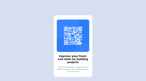
Hi, @Ariyoola45 👋. Congratulations on completing this challenge, here are some suggestions to improve your code:
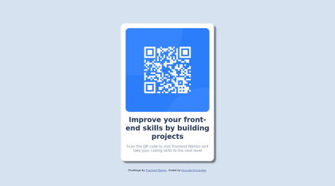
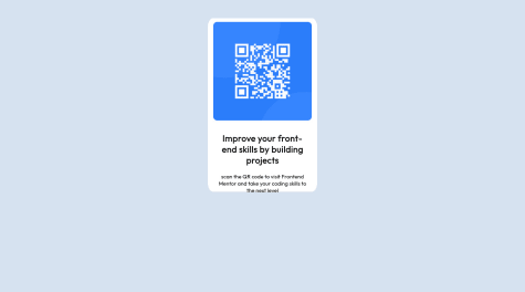
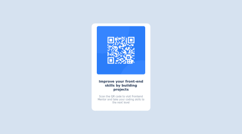
img references should be this:<link rel="stylesheet" href="css/styles.css">
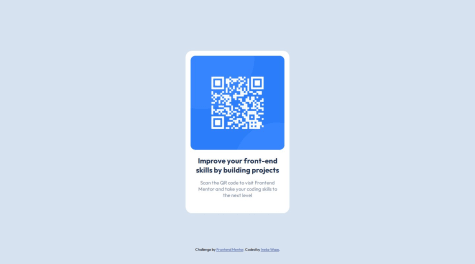
<img src="img/image-qr-code.png" alt="qr code">
respectively.
<section class="step1"></section> should be a <main></main> tag according to markup rules, hence it shows that its child elements are the main contents of the page..step1{
position: absolute;
top: 50%;
left: 50%;
transform: translate(-50%, -50%);
}
I hope this helps
Happy Coding @Ariyoola45
Hi, @LautaroMendez86 👋. Congratulations on completing this challenge, you did a nice job. You could try these few suggestions out on the accessibility:
<div class="attribution"></div> a <footer></footer> instead, seems cool and more structural.espero que esto ayude :)
Keep Coding @LautaroMendez86
A ll feedback is welcome Thank you in advance
Hi, @jihadsamad 👋. Congratulations on completing this challenge, you did a nice job. You could try these few suggestions out:
<div class="first-div"></div> should be wrapped in a <main></main> tag, for easy recognition by any web browser, it stands out as the main content of the web page or just rename the 'div' to 'main'..first-div {
position: absolute;
top: 50%;
left: 50%;
transform: translate(-50%, -50%)
}
I hope this helps :)
Keep Coding @jihadsamad
Any feedback would be appreciated
Hi, @alexisshy 👋. Congratulations on completing this challenge, you did a nice job. You could try these few suggestions out on the accessibility:
I hope this helps :)
Keep Coding @alexisshy
In the first version I didn't use semantic html (hadn't heard about it yet). So next time I would use that inmediately.
What challenges did you encounter, and how did you overcome them?Did not really encounter problems.
What specific areas of your project would you like help with?I completed this challenge quite some time before learningpaths, I already got some feedback.
Hi, @Ineke84 👋. Congratulations on completing this challenge, you did a nice job. You could try these few suggestions out on the accessibility--the best practice like you said:
I hope this helps :)
Keep Coding @Ineke84
I'm welcome any comment and if anyone could suggest any useful resource for implementing Grid and Flexbox for this challenge, that would be really helpful. What approach do you use to solve this? Mobile-first or do desktop first then use media query? Thank you all!
Hi @vivo1310, congratulations on completing this challenge, you did a very nice job on this. It's about 80% pixel perfect, which is very nice. Here are a few suggestions on the accessibility of your code:
Great Work @vivo1310, Keep Coding
Hi guys, this is my 3rd challenge. I'm getting really excited and curious about the other challenge, but I need to really understand each step.
This one is pretty simple, yet I'm still struggling. Any feedback is really appreciated, pals. TIA. HAPPY CODING! 😊
Hi @thresholdtech, congratulations on completing this challenge, nice work you have done here. Here are a few suggestions on the accessibility of your code:
Great Work @thresholdtech, Keep Coding