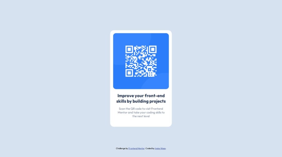
Design comparison
SolutionDesign
Solution retrospective
What are you most proud of, and what would you do differently next time?
In the first version I didn't use semantic html (hadn't heard about it yet). So next time I would use that inmediately.
What challenges did you encounter, and how did you overcome them?Did not really encounter problems.
What specific areas of your project would you like help with?I completed this challenge quite some time before learningpaths, I already got some feedback.
Community feedback
- @RubylenshyPosted about 2 years ago
Hi, @Ineke84 👋. Congratulations on completing this challenge, you did a nice job. You could try these few suggestions out on the accessibility--the best practice like you said:
- The <div class="container-main"></div> should be wrapped in a <main></main> tag, for easy recognition by any web browser, it stands out as the main content of the web page or just rename the 'div' to 'main'
- How about you make <div class="attribution"></div> a footer instead, seems cool and more structural.
- You could also add an 'alt' attribute to the image. Kudos 👌.
- And an easy way to position your card at the center of the page is: .conatainer-main {position: absolute; top: 50%; left: 50%; transform: translate(-50%, -50%)
I hope this helps :)
Keep Coding @Ineke84
Marked as helpful0
Please log in to post a comment
Log in with GitHubJoin our Discord community
Join thousands of Frontend Mentor community members taking the challenges, sharing resources, helping each other, and chatting about all things front-end!
Join our Discord
