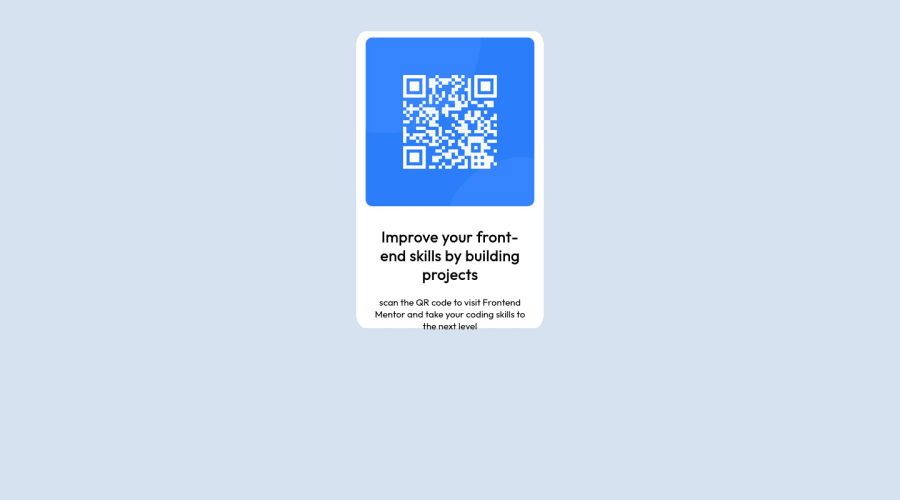
Design comparison
SolutionDesign
Solution retrospective
A ll feedback is welcome Thank you in advance
Community feedback
- @RubylenshyPosted about 2 years ago
Hi, @jihadsamad 👋. Congratulations on completing this challenge, you did a nice job. You could try these few suggestions out:
- The
<div class="first-div"></div>should be wrapped in a<main></main>tag, for easy recognition by any web browser, it stands out as the main content of the web page or just rename the 'div' to 'main'. - And an easy way to position your card at the center of the page without any margin is:
.first-div {
     position: absolute;
     top: 50%;
     left: 50%;
     transform: translate(-50%, -50%)
}
I hope this helps :)
Keep Coding @jihadsamad
0 - The
Please log in to post a comment
Log in with GitHubJoin our Discord community
Join thousands of Frontend Mentor community members taking the challenges, sharing resources, helping each other, and chatting about all things front-end!
Join our Discord
