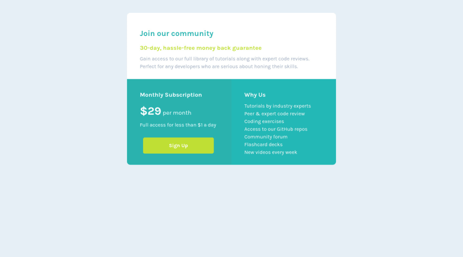


Design comparison

Solution retrospective
Hi guys, this is my 3rd challenge. I'm getting really excited and curious about the other challenge, but I need to really understand each step.
This one is pretty simple, yet I'm still struggling. Any feedback is really appreciated, pals. TIA. HAPPY CODING! 😊
Community feedback
- @Mosestule2003Posted about 2 years ago
Hey just saw your solution, again amazing work. 👍 Just a few tips to help with your work
- First use
- body{ Display: flex Align-items: center; Justify-content: center; } Or you can use this *body{ Position: relative; } *container{ position: absolute; Top: 50%; Left:50% Transform: translate(-50%, -50%); } This will center your container in your page properly.
- Secondly to make the last two containers responsive for mobile use this
- create a grid container and two grid items .Grid-container{ Display-grid: grid; Grid-template-column: repeat(2,1fr); Grid-auto-rows: minmax(100px,auto); (This is to make the container responsive). } Within the grid-item containers you made put the content meant from the green boxes there.
- lastly add a media query for the responsiveness, and target the grid- container class giving it a display of block. With this you have an improved solution. Hope this helped happy coding 👍👨🏾💻
0@thresholdtechPosted about 2 years agohello again, @Mosestule2003 thank you so much for your time on my work, it means a lot to me. Really appreciate every feedback you mention. I will note every suggestion in my book for sure.
I forgot the media query part, thank you to remind me! happy coding!
0@Mosestule2003Posted about 2 years ago@thresholdtech it's alright. Hey I noticed something in your GitHub repo that shouldn't be there. The readme.md template is what is shown there instead of your own custom readme file. Like your meant to use the template as a reference for yours and when done, delete the template file. Please note this is very important 👌
0@thresholdtechPosted about 2 years ago@Mosestule2003 thanks for letting me know. Already deleted them.
0 - @RubylenshyPosted about 2 years ago
Hi @thresholdtech, congratulations on completing this challenge, nice work you have done here. Here are a few suggestions on the accessibility of your code:
- Your <div class="main-page"></div> should be wrapped in a <main></main> tag for easy recognition by the any web browser, it stands out as the main content of the webpage according to markup rules or rather rename the div to main.
- And you could center your "main-page" by writing this: {position: absolute; top: 50%, left: 50%, transform: translate(-50%, -50%)}
Great Work @thresholdtech, Keep Coding
0@thresholdtechPosted about 2 years agoHi @Rubylenshy,
really appreciate your feedback! I still struggling with the format part (margin, padding, position, etc). I will learn your feedback for sure! Thanks a lot! Happy coding!
1@RubylenshyPosted about 2 years agoHey, @thresholdtech. I can relate with that, I struggled with position for a few weeks before I could stand my ground, And you're very welcome - Rome wasn't built in a day my friend.
Let's Keep Learning
0@thresholdtechPosted about 2 years ago@Rubylenshy thanks for your kind words! Keep learning !
1


Please log in to post a comment
Log in with GitHub
Join our Discord community
Join thousands of Frontend Mentor community members taking the challenges, sharing resources, helping each other, and chatting about all things front-end!
Join our Discord