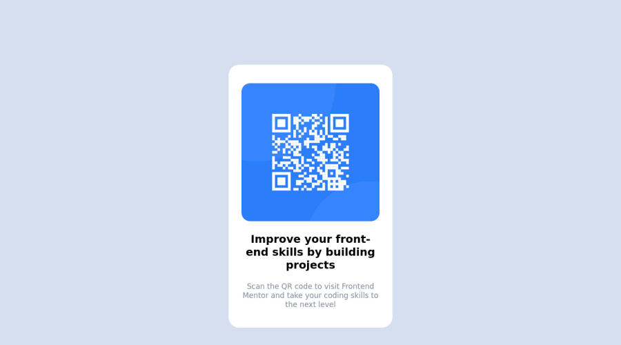
Design comparison
Solution retrospective
How do I use flexbox to center a div? How can I make this responsive on all devices?
Community feedback
- @RubylenshyPosted about 2 years ago
Hi @uchethecreator 👋, a very nice job you've done here. However, here are some suggestions on how your build-up should look exactly like the design:
- Change
<div class="container"></div>to<main></main>tag as this will show that it is the main content of the webpage, do a similar thing to the<div class="attribution"></div>, change that to a<footer></footer>tag. - You might wanna add an
altattribute to yourimgtag & check the HTML validation errors on the reports to enhance your code. - You could check out my solution on this same challenge if you wish to make it responsive.
- An easy way to center your container:
.container{ position: absolute; top: 50%; left: 50%; transform: translate(-50%, -50%); }- You could center a div--with flexbox--just like this:
div{
  width: 100%;
  min-height: 100vh;
  display: flex;
  flex-direction: column;
  justify-content: center;
  align-items: center;
}
I hope this helps 👍
Keep Coding @uchethecreator
Marked as helpful0@vanzasetiaPosted about 2 years ago@Rubylenshy
Hey, Reuben!
Next time, please avoid asking the solution author to mark your comment as helpful. It is against the community guidelines. Also, it puts unnecessary pressure on the solution author to mark your comment as helpful.
The idea is to give people feedback to offer helpful support without the expectation of anything. If the solution author does mark the comment as helpful, then that's a nice bonus. 🙂
1@vanzasetiaPosted about 2 years ago@Rubylenshy
I recommend using modern CSS techniques such as a grid or flexbox to position the card to the center of the page. Absolute positioning can introduce overflow bugs and it also requires more code to implement.
Other than that, everything else is looking good to me. 🙂
0@RubylenshyPosted about 2 years ago@vanzasetia
Well, that makes the both of us. I actually found it tacky in a page with more contents. Thanks for the recommendation.
1@uchethecreatorPosted about 2 years ago@Rubylenshy hello, Thank you for the corrections, I have corrected all errors. Thanks for your contribution, you were helpful.
0@RubylenshyPosted about 2 years ago@uchethecreator Glad I could be, great job and keep coding
0 - Change
- @MelvinAguilarPosted about 2 years ago
Hi @uchethecreator 👋, good job for completing this challenge and welcome to the Frontend Mentor Community! 🎉
Here are some suggestions to improve your code:
- There are two modern CSS techniques to center elements:
Using flexbox layout:
body {
   width: 100%;
   min-height: 100vh;
   display: flex;
   flex-direction: column;
   justify-content: center;
   align-items: center;
}
Using grid layout
body {
   width: 100%;
   min-height: 100vh;
   display: grid;
   place-content: center;
}
More information: A Complete Guide to Flexbox (CSS-Tricks) | How TO - Center Elements Vertically (W3Schools) | CSS Layout - Horizontal & Vertical Align (W3Schools)
- And remove
margin: 0 auto;,position: relative;andtop: 150px;in your.containerselector - Remove the
margin-top: 250px;from the.attributionselector - Use
max-width: 320pxto.containerselector instead of width. - Use
width: 100%;to the image instead ofwidth: 320px;
Try to use semantic tags in your code. More information here:
With semantic tags:
<body> <main class="container"> . . . </main> <footer class="attribution"> . . . </footer> <body>- Add a
<h1>tag in your solution, The<h1>element is the main heading in a web page. There should only be one<h1>tag per page, and always avoid skipping heading levels; always start from<h1>, followed by<h2>and so on up to<h6>(<h1>,<h2>,...,<h6>). The HTML Section Heading elements (Reference)
Solution:
<h1>Improve your front-end skills by building projects</h1>I hope those tips will help you.
Good Job and happy coding !
Marked as helpful0 - @vanzasetiaPosted about 2 years ago
Hi there! 👋
Congratulations on completing your first Frontend Mentor challenge! 🎉
You already got lots of useful feedback. There are two things that I want to add:
- First, I recommend using a code-formatter such as Prettier to format your code automatically. This will help people and yourself to understand the code much easier.
- Second,
imgmust always havealtattribute. Also, the QR code is not a decorative image. So, it needs alternative text.
I hope this helps! Happy coding!
0
Please log in to post a comment
Log in with GitHubJoin our Discord community
Join thousands of Frontend Mentor community members taking the challenges, sharing resources, helping each other, and chatting about all things front-end!
Join our Discord
