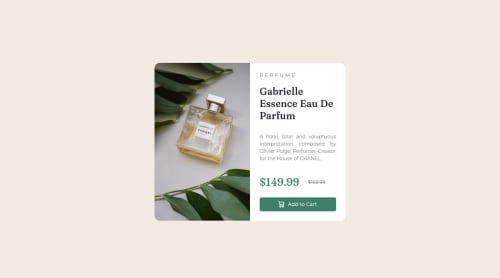
Design comparison
Solution retrospective
I'm welcome any comment and if anyone could suggest any useful resource for implementing Grid and Flexbox for this challenge, that would be really helpful. What approach do you use to solve this? Mobile-first or do desktop first then use media query? Thank you all!
Community feedback
- @RubylenshyPosted about 2 years ago
Hi @vivo1310, congratulations on completing this challenge, you did a very nice job on this. It's about 80% pixel perfect, which is very nice. Here are a few suggestions on the accessibility of your code:
- Your <div class="container"></div> should be wrapped in a <main></main> tag for easy recognition by the any web browser, it stands out as the main content of the webpage according to markup rules. Or rename the div to main.
- And there seems to be an error in the link:font-googleapi, this could be because the format or link text was altered. How about you adopt the @import style of fonts, that seems easy and less wordy, you should try it out. Copy and paste to the first line of your stylesheet and you're good to go.
Great Work @vivo1310, Keep Coding
Marked as helpful1 - @Mosestule2003Posted about 2 years ago
Hey I really love your work 👍. Although a have a few tips to help improve your work.
- On the mobile screen size try reducing the padding to something like 1em. Hope this helped, happy coding 👍👨🏾💻
1@vivo1310Posted about 2 years ago@Mosestule2003 Hi thanks for your comment. Could you justify why you suggest 1em for the padding?
1
Please log in to post a comment
Log in with GitHubJoin our Discord community
Join thousands of Frontend Mentor community members taking the challenges, sharing resources, helping each other, and chatting about all things front-end!
Join our Discord