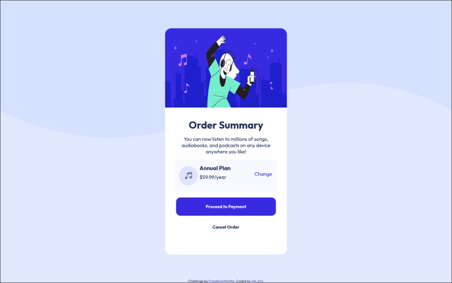
Design comparison
SolutionDesign
Solution retrospective
That's the first proposition. What do you think about it ?
Community feedback
- @RubylenshyPosted about 2 years ago
Hi @Valeryio 👋. You've done quite well on this one, good job. Maybe this few suggestions might be of help:
- With responsiveness in view, that
.cardwon't survive much with the kindawidthproperty applied to it, you should check out how to make use of thesemax-widthandmin-widthfrom this resourcehttps://www.freecodecamp.org/news/css-properties-examples/ - You should try to use a
display: flex;property, it saves you some more lines of code and excess margins
.plan{
   display: flex;
   justify-content: space-between;
   align-items: center;
}
While you make the html markup work like this:
<div class="plan">
       <img src="" alt="">
    <div>
        <h2>Annual Plan</h2>
        <span class="price">$59.99/year</span>
   </div>
       <span class="change" >Change</span>
</div>
Check out this resource for more on
flexdisplay.https://developer.mozilla.org/en-US/docs/Web/CSS/justify-contentHope this helps
Keep Coding @Valeryio
0@ValeryioPosted about 2 years ago@Rubylenshy Thanks a lot guy. This comment was very useful, and I learnt the using of min, and max properties. Thanks too much one again !
See you !
1 - With responsiveness in view, that
Please log in to post a comment
Log in with GitHubJoin our Discord community
Join thousands of Frontend Mentor community members taking the challenges, sharing resources, helping each other, and chatting about all things front-end!
Join our Discord
