
@ericaimhigh1

P
Jeremy Helsel
@JIH7All comments
- P@JIH7
Looks great! Like you said yourself, it's a pretty simple project, not a ton to improve on. The only thing I noticed in your code is there's an unused media query in your CSS.
- @hanifehjanbazP@JIH7
Looking sleek and mobile friendly! Good semantic HTML markup and style rules. Really any feedback I could give are super small nitpicks. Starting with mobile styles and using media queries for tablet/desktop is generally considered a better workflow than starting with desktop and working your way down. It's something I've only somewhat recently started doing myself. The only other thing that I think could really help this project shine is a custom readme! Right now you've got the default Frontend Mentor
README.mdshowing on your GitHub repo, and adding your own does wonders for making the project look better. I always find theREADME-template.mdthat comes with these projects to be a great jumping off point.Marked as helpful - @tunabearfishP@JIH7
Looking good overall! One issue I noticed, I believe you're trying to select the
bodyelement with the selector.body. The dot at the begginning makes this a class selector. So it would work for<body class="body"></body>. Changing it to justbodywould apply the styles in the way I think you're intending to. I downloaded your code and tried that and it put the container nice and centered on the screen.I've also noticed you have a white box shadow on the container, causing it to blend in with the white background. When a color is added, the borders of
.containerextend past the content. To get the box shadow working properly, try giving.containera proper width instead of a full screen width of 1440px. Something like 736px is more akin to the design. You will of course have to change the widths of the objects in between to avoid them squishing down since you're using percentages, but the page will look better because you did it. You probably also want to change thejustify-contentof.containertospace-between. The flex rules you've set up on body will keep the container centered on the screen for you.You've got a solid start here and with some tweaks it could look really great! After that, try challenging yourself to learn CSS media queries to make it look good on mobile! That way, you can selectively apply CSS styles based on the screen size. Here's an article about that. Remember to hit f12 and open your browsers dev tools, then select different screens under "dimensions" at the top to see how it would look on different phones and tablets. Best of luck! Feel free to respond with any clarification questions
- @LucasLacs315P@JIH7
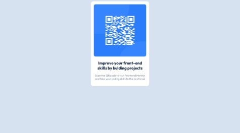
Hey! Awesome that you're starting your journey as a front end developer. Right now, there are a lot of ways you can improve this project. Your style tag isn't within the head tag, which could cause some issues. It also appears you're using qrcode.html file mostly for style, then loading the index.html file into an iframe. This is a pretty unusual approach and wouldn't really be considered best practice by most. If you would like to seperate your styles from the content, consider making a .css file and importing that into your html file with a
<link>tag within the<head>. You can put your styles in there.The content in index.html also appears to be untagged. Just like with your
body,iframeandimagetags, you generally want all of your text to be within tags too. For instance "Improve your front-end skills by building projects" would be great inside of a heading 1 or<h1>tag. So something like<h1>Improve your front-end skills by building projects</h1>. The second line of text is great for a paragraph or<p>tag. This makes it easier for search engines like Google to understand your website, helps people with accessibility needs navigate your website, makes things easier to style, and will make it easier for you to work on a project you haven't touched in a while.I noticed you have a hover effect on the image, that isn't really required for this particular project if you would like to make it look like the design image.
Also you can round the edge of the image with the css
border-radiusproperty. Something likeborder-radius: 10px;on the image would make it look more like the one in the design.I made a version of this as well if you'd like to see the code. Ignore the
.scssfiles, that's a tool I used to help me write css and not something to worry about yet. The important files here areindex.htmlandstyle.css. Live version of the site here.Let me know if you have any questions I can help with. Best of luck to you! Keep learning and you'll be making beautiful web pages before you know it :D
- @Ahmedd26P@JIH7
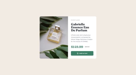
Looks great! One small oversight I noticed is that the price text is supposed to be green instead of gray. Otherwise very solid job replicating the design! Looks good on mobile and hover state on the button works well too. Great job!
Marked as helpful - @iftekharhasan2P@JIH7
Overall looks good! I noticed you're not using the same font as the design. Check the included
style-guide.mdfile for fonts used in the project. Then you can get whatever font you need from Google fonts and import it in the head of your HTML. Google fonts will actually prepare the necessary link statement and CSS rules on the right side of the screen.Also the heading on the white tiles looks like it's supposed to be some shade of gray instead of black and the heading text should be a little smaller. Colors used should also be in the
style-guide.md. Great work!Marked as helpful - @Jaheim-DouglasP@JIH7
The link to the Github repo doesn't appear to work so I can't see your code, but if you're trying to center the "container" div on the screen, you'll want the body to have a height equal to the screen height. HTML elements will automatically grow wide enough to fill the available space, but will only grow as tall as they have to to fit all of the content inside. Setting the body tag to the height of the viewport helps with this.
body {
    height: 100vh;
    display: flex;
    flex-direction: column;
    justify-content: center;
}
A
vhis equal to 1/100 of the screen height and avwis 1/100 of the screen width. You don't want to overuse these units as it can cause problems, but putting them on the body is generally fine. - @ouariadamP@JIH7
Looks good on desktop! I did notice the layout isn't currently responsive so it doesn't look right on mobile. If you're not familiar with media queries, I suggest checking them out.
Making sure your site looks good on mobile is really important since that's the way most people engage with the web.
Also if you add a hover effect on the button it will go a long way towards making things feel nice. Here's an easy way to do that in your CSS.
.buy:hover{ background-color: hsl(158, 42%, 18%); } - @electr0spaceP@JIH7
This looks great! I really love the touch of the button getting larger on hover and the dialogue window for clicking. Very satisfying.
I think the way you're swapping the images is perfect, and it's also what I did for this challenge. It's mobile first which is great, and it's probably the simplest way to do that. Sure there'll always be an extra
<img>tag in the hierarchy, but nevertheless this is the best way I've found to do this both in terms of performance and complexity.Marked as helpful - @mariabpulgarP@JIH7
It actually looks good for me on Firefox for Android! Wish I had an iPhone to test it on and see the issue myself.
Some other things worth noting though, practicing semantic HTML is always a good thing to do. This is just a small component so there's not a ton of use for semantic tags, but one major one is that the
<div>with the.main-containerclass should maybe be an<article>instead. Using semantic tags instead of regular<div>'s when applicable is great for people using screen readers.Here's an article on semantic tags!
Also it's generally good practice to avoid
!importantin CSS. Try using a more specific selector instead when possible.Marked as helpful - @BBualdoP@JIH7
Hey, this looks really awesome. It can be very frustrating when you can't get things working quite right, but the HTML and CSS are on point and you have a lot of the functionality there.
I think a great resource for learning arrays and OOP (and where I learned them) is the 100devs course by Leon Noel on YouTube. You can probably skip the early classes because your HTML and CSS skill are absolutely on point.
You mentioned not understanding how your delete button works, let's take a look at it. Your current solution is concise, well formatted, and would probably be the way to do it in production for a company, but lets do a refactor along the way to make it easier to understand.
document.querySelectorAll('.delete-button')
    .forEach((deleteButton, index) => {
      deleteButton.addEventListener('click', () => {
        todoList.splice(index, 1);
        renderTodoList();
    });
  });
You start by calling
document.querySelectorAll('.delete-button'). This goes through the document and finds ever item with the.delete-buttonclass and adds them to an array. For readability, lets store that array in a variable insteadconst deleteButtons = document.querySelectorAll('.delete-button'); deleteButtons .forEach((deleteButton, index) => { deleteButton.addEventListener('click', () => { todoList.splice(index, 1); renderTodoList(); }); });Then you call
array.forEach()method on the array..forEachis a "higher order function," meaning it takes another function as an argument, which you're currently doing with an arrow function. Let's abstract that out into it's own function to make it more readable for us.const deleteButtons = document.querySelectorAll('.delete-button'); deleteButtons.forEach((deleteButton, index) => addDeleteListeners(deleteButton, index)); function addDeleteListeners(deleteButton, index) { deleteButton.addEventListener('click', () => { todoList.splice(index, 1); renderTodoList(); }) }You do still have to use an arrow function to get the arguments but I think this makes things a little more readable for this.
.forEachwill loop through our array and perform a function on each item within it. In the arrow function of a.forEachthe first argument is always the item itself. You can name it whatever you want, in this case it'sdeleteButtonbut you could name itelement,el,e,zebra,fdsfjdsahfksldahetc. You can actually just have one argument if all you need is the item. So that would look likedeleteButtons.forEach((deleteButton) => addDeleteListeners(deleteButton,));We will, however, need the index as well. Since arrays are a numbered list of objects, index represents an item's position in the array. Indexes start at 0 so the first item's index will always be 0, not 1. We can actually access an individual item with the index using square brackets notation.const deleteButtons = document.querySelectorAll('.delete-button'); console.log(deleteButtons[0]); console.log(deleteButtons[1]); console.log(deleteButtons[2]);This will output each the first three buttons' HTML markup to the console. So index will be the second argument of
.forEach. We can technically name it whatever we want, but generally justindexoriis a good practice. Fun fact, you could add a third argument to this function, and that would be the array itself. Once again you can call it whatever you want. SodeleteButtons.forEach((deleteButton, index, array) => addDeleteListeners(deleteButton, index, array));We don't need to do that for this particular case however.So onto the main part of this function.
deleteButton.addEventListener('click', () => {
      todoList.splice(index, 1);
      renderTodoList();
    })
I won't explain event listeners as you already seem pretty comfortable with them, but note that since we are iterating over each element, it is adding an event listener to every object in the array.
Within the event listener you're using
array.splice()on your todoList array..spliceis a function that removes an item from the array at a specific index. This is where our reference to the index comes in handy! Since every item in the todoList array has a delete button,todoListanddeleteButtonswill always be the same length, and because.querySelectorAllreads from top to bottom, they will always be in the same order! So.spliceremoves things from the array at a specific index, for that we'll just user our handy dandyindexvalue. The second argument is how many items to remove. Of course for our purposes we only need to remove the item that is being deleted, so we just have that be 1. I hope this explanation helps!I bet you could totally get the clear all button working! You very similarly use a
.forEachwith an if statement inside the function. in a statement liketodoList.forEach((todo, index) => {//Your code here}), you can check iftodohas the.completedclass and splice it out if it does. Best of luck and keep up the awesome work!Marked as helpful - @MonicaNeveP@JIH7
Looks good! I would give the text on the buttons and the star image
user-select: noneso that they can't be highlighted.Looking at your script, I think it would make your code more readable if you used camel casing. Instead of
howcontainernumbersayinghowContainerNumbermakes things more readable. General convention is you have the first word lowercase, capitalize every word after. Camel casing is the most common way to go in the JavaScript world but you can use other kinds like snake casinghow_container_numberor Pascal casingHowContainerNumber(same as camel but the first word is capitalized too.) - @KevinDeBenedettiP@JIH7
Looks really good! Great job matching the exact dimensions, both the desktop and mobile layouts look great. I noticed you don't have the hover effect on the button. That should be really easy to add with:
.btn:hover{
    background-color: hsl(158, 42%, 18%);
}
They don't supply the color for the hover effect in the style guide for some reason, but that should be the hsl value you need for it based on the design images.
Marked as helpful - @carolalvesdevP@JIH7
You're very close to having it aligned in the center! The body needs
justify-content: center. If you've tried that and it wasn't working, that's because you also need to scale the body to the height of the screen. Give it amin-height: 100vhas well. Those two things should make the content sit nicely in the center of the page. This will make it so the body stretches to at least the height of the screen, but using min-height ensures that if you're ever making an application that is taller than the viewport, the body element will continue to scale as it would normally.Marked as helpful - @HananeEL-2023P@JIH7
Overall this looks fantastic! I think making the body a flex container and centering everything like the above commenter said will also fix some layout issues on mobile. Right now
parent-containeris not neatly centered on the X-axis on mobile and that same fix should take care of it.I'd also consider giving the text in the score span and button a
user-select: noneproperty. That'll prevent the user from highlighting it.The semantic HTML tag choices in this are on point. Awesome job!
Marked as helpful - @NawalMalkiP@JIH7
Looks great! Especially considering this is your first Tailwind project. If you want things to be more exact, try using the square brackets
[]notation to insert arbitrary values. I seemax-[640px]in there a lot, I'm not familiar with themaxutility class, but for other classes in Tailwind this is incredibly useful. If you want percentage based height or width for instance, and you aren't happy with the selection of fractions tailwind has, you can sayh-[65%]to get something more specific. All units, like px, %, ems, rems, vw, etc all work with this syntax.Marked as helpful - @Anjali-Git-HubP@JIH7
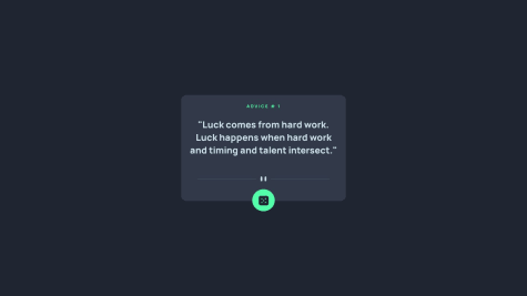
Looks good!
I would remove this line:
h1.textContent=""The h1 going blank for a second between advices looks like a mistake. You can just let the old advice stay while the app fetches and it'll make it less obvious for the user that loading is happening and isn't instantaneous.
In your HTML, you're loading your script in the head of the document. Generally it's best practice to put your script tag as the last thing inside of <body>. Moving your script here will improve page load times because it allows the rest of your HTML to load in before the script.
Also the app is trying to load
/favicon.ico:1which isn't present in the project and that's causing a console error.Aside from those nitpicks, love the design and I think the general look of yours is closer to the provided design than mine!
Marked as helpful - @hassaneljebylyP@JIH7
I think your code looks great and you have a very comprehensive solution! I also did this challenge recently. I don't know if this is better or worse overall, but rather than fully checking valid IP and domain formatting, I did a check to see if the input is all numbers and dots to determine whether to make a request for IP or domain. Then if the API returns an error I put the error message on screen. My solution's repo is here if you wanna compare!
https://github.com/JIH7/iptracker
The UI is also very crisp. The only issue I can find is that the map draws on top of the "result" div when clicked. I'm sure giving it a higher z-index value would fix this!
Marked as helpful