

Design comparison

Solution retrospective
Any suggestions or improvements you can provide to help me enhance my coding skills are welcome
Community feedback
- P@JIH7Posted over 1 year ago
Overall this looks fantastic! I think making the body a flex container and centering everything like the above commenter said will also fix some layout issues on mobile. Right now
parent-containeris not neatly centered on the X-axis on mobile and that same fix should take care of it.I'd also consider giving the text in the score span and button a
user-select: noneproperty. That'll prevent the user from highlighting it.The semantic HTML tag choices in this are on point. Awesome job!
Marked as helpful0 - @adityaphasuPosted over 1 year ago
Hello, @elkaabahanane
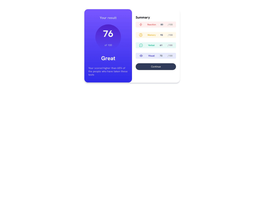
As you can see from the screenshot the
.parent-containeris not centered on the page. You can center it on the page by using flex on the body like this:body{ min-height: 100vh; display: flex; align-items: center; justify-content: center; }- We use
min-height:100vhon the body because flexbox needs height to work upon and this will make sure the content is always in the center and doesn't cut off even if seen from landscape mode on devices or else if we don't specify it the component wouldn't center itself vertically.
Some suggestions regarding best practices:
- Instead of using
divfor.parent-containerto represent the whole content on the page try using a tag like<main>which is more semantic and tells the search engines and assistive technologies that the content inside it is the main content of the page like this:
<main class="parent-container"> //rest of the content </main>- Instead of using
pxfor font size which is an absolute unit try usingremwhich is a relative unit and scales well with layouts. Give this a read as it will help you to understand a lot better!
and lastly, give yourself a pat on the back on completing the challenge! Good job!!
Keep up the hard work and happy coding!😊
Marked as helpful0 - We use


Please log in to post a comment
Log in with GitHub
Join our Discord community
Join thousands of Frontend Mentor community members taking the challenges, sharing resources, helping each other, and chatting about all things front-end!
Join our Discord