Design comparison
Solution retrospective
Is this solution ok or somenthing more to add?
Community feedback
- P@JIH7Posted over 1 year ago
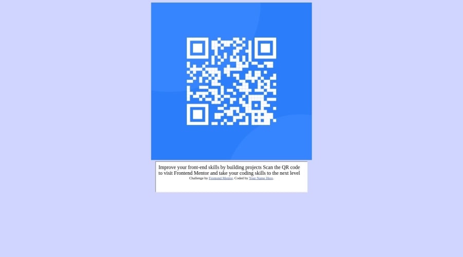
Hey! Awesome that you're starting your journey as a front end developer. Right now, there are a lot of ways you can improve this project. Your style tag isn't within the head tag, which could cause some issues. It also appears you're using qrcode.html file mostly for style, then loading the index.html file into an iframe. This is a pretty unusual approach and wouldn't really be considered best practice by most. If you would like to seperate your styles from the content, consider making a .css file and importing that into your html file with a
<link>tag within the<head>. You can put your styles in there.The content in index.html also appears to be untagged. Just like with your
body,iframeandimagetags, you generally want all of your text to be within tags too. For instance "Improve your front-end skills by building projects" would be great inside of a heading 1 or<h1>tag. So something like<h1>Improve your front-end skills by building projects</h1>. The second line of text is great for a paragraph or<p>tag. This makes it easier for search engines like Google to understand your website, helps people with accessibility needs navigate your website, makes things easier to style, and will make it easier for you to work on a project you haven't touched in a while.I noticed you have a hover effect on the image, that isn't really required for this particular project if you would like to make it look like the design image.
Also you can round the edge of the image with the css
border-radiusproperty. Something likeborder-radius: 10px;on the image would make it look more like the one in the design.I made a version of this as well if you'd like to see the code. Ignore the
.scssfiles, that's a tool I used to help me write css and not something to worry about yet. The important files here areindex.htmlandstyle.css. Live version of the site here.Let me know if you have any questions I can help with. Best of luck to you! Keep learning and you'll be making beautiful web pages before you know it :D
3 - @Nathan-Rodrigues0Posted over 1 year ago
Está no caminho ! agora falta redirecionar a imagem dentro da caixa (div), centralizando-a, colocando estilizações como: border-radius, width e personalizando as fontes (letras)
1
Please log in to post a comment
Log in with GitHubJoin our Discord community
Join thousands of Frontend Mentor community members taking the challenges, sharing resources, helping each other, and chatting about all things front-end!
Join our Discord
