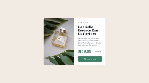
Not Found
Not Found
Not Found
Not Found
Not Found
Not Found
Not Found
Not Found
Not Found
Your session has expired please log in again.
Not Found
Not Found
Not Found
Not Found
Not Found
Not Found
Not Found
Not Found
Not Found

Submitted

Responsive product card with HTML/CSS/JS (interaction with button)

Alina 150

@electr0space

Desktop design screenshot for the Product preview card component coding challenge

This is a solution for...

  • HTML
  • CSS
1newbie
View challenge

Design comparison


SolutionDesign

Solution retrospective


Hello amazing community! 👋

I'd like to ask you a question: what are your solution for displaying one image for desktop and another for mobile?

Decided to simply go with :

.mobile-img {
    display: none;
}
@media only screen and (max-width: 745px) {
    .desktop-img {
        display: none;
    }
}

What do you think? 😅

Community feedback

P

@JIH7

Posted

This looks great! I really love the touch of the button getting larger on hover and the dialogue window for clicking. Very satisfying.

I think the way you're swapping the images is perfect, and it's also what I did for this challenge. It's mobile first which is great, and it's probably the simplest way to do that. Sure there'll always be an extra <img> tag in the hierarchy, but nevertheless this is the best way I've found to do this both in terms of performance and complexity.

Marked as helpful

1

Alina 150

@electr0space

Posted

Thank you @JIH7! ☺️

0

@CpalmerD20

Posted

CSS media queries are a great way to accomplish this.

Another fantastic way is with a picture element in HTML: https://developer.mozilla.org/en-US/docs/Web/HTML/Element/picture

The main upside to the picture tag is the media query and images will stay relevant to where they are in the document (inside HTML). Which also helps keep CSS concise and organized.

1

Alina 150

@electr0space

Posted

Hello @CpalmerD20, Thank you for your reply! Interesting solution, will definitely try this one next time.☺️

0

@geekSamarth

Posted

Hello Alina, your solution looks perfect, instead of using 'display: none' you can use little bit of javascript and change the src attribute of the image according to the screen size.

Hope it will help you, Happy coding!!.

1

Alina 150

@electr0space

Posted

Hi @samarth-bytes , thank you for the advice, I've just started learning JavaScript and will try to implement your solution next time! ☺️

0

Please log in to post a comment

Log in with GitHub
Discord logo

Join our Discord community

Join thousands of Frontend Mentor community members taking the challenges, sharing resources, helping each other, and chatting about all things front-end!

Join our Discord