Not Found
Not Found
Not Found
Not Found
Not Found
Not Found
Not Found
Not Found
Not Found
Not Found
Not Found
Not Found
Not Found
Not Found
Not Found
Not Found
Not Found
Not Found
Not Found
Not Found

Submitted

HTML and CSS, FLEXBOX

@tunabearfish

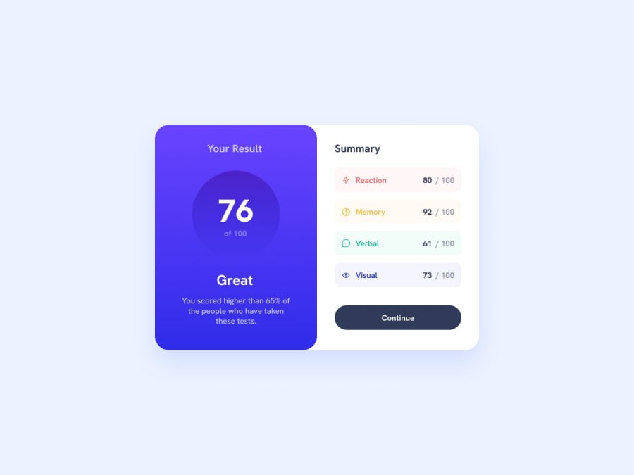
Desktop design screenshot for the Results summary component coding challenge

This is a solution for...

  • HTML
  • CSS
1newbie
View challenge

Design comparison


SolutionDesign

Solution retrospective


I had trouble getting my summary section, had to play around more, I think there are more efficient ways of doing this, but this was what I was able to do

Community feedback

P

@JIH7

Posted

Looking good overall! One issue I noticed, I believe you're trying to select the body element with the selector .body. The dot at the begginning makes this a class selector. So it would work for <body class="body"></body>. Changing it to just body would apply the styles in the way I think you're intending to. I downloaded your code and tried that and it put the container nice and centered on the screen.

I've also noticed you have a white box shadow on the container, causing it to blend in with the white background. When a color is added, the borders of .container extend past the content. To get the box shadow working properly, try giving .container a proper width instead of a full screen width of 1440px. Something like 736px is more akin to the design. You will of course have to change the widths of the objects in between to avoid them squishing down since you're using percentages, but the page will look better because you did it. You probably also want to change the justify-content of .container to space-between. The flex rules you've set up on body will keep the container centered on the screen for you.

You've got a solid start here and with some tweaks it could look really great! After that, try challenging yourself to learn CSS media queries to make it look good on mobile! That way, you can selectively apply CSS styles based on the screen size. Here's an article about that. Remember to hit f12 and open your browsers dev tools, then select different screens under "dimensions" at the top to see how it would look on different phones and tablets. Best of luck! Feel free to respond with any clarification questions

0

Account Deleted

Haven't looked at it very closely yet, but you have an error in your CSS. You have to remove the dot before the body selector, since it is now looking for a class called body instead of the tag!

Cheers!

0
kore4lyf 120

@kore4lyf

Posted

Hello, there I'll suggest you use display: grid and place-content: center on your body to center your container on the page.

0

Please log in to post a comment

Log in with GitHub
Discord logo

Join our Discord community

Join thousands of Frontend Mentor community members taking the challenges, sharing resources, helping each other, and chatting about all things front-end!

Join our Discord