
@SergiuStancioiu

bikeinman
@BikeInManAll comments
- @BikeInMan
Hi,
Nice work so far. Desktop design is close to the requirements.
However, on small screen sizes, there are a couple of problems. The first card is missing border color on top. And there is no gap/margin between cards.
Also, on tablet sizes. The cards seem to stretch all the way to the sides. To prevent this consider setting a max-width on cards. eg:
.card-content {
max-width: 300px;
margin: 10px;
}
Good Luck
Marked as helpful - @beatrizang@BikeInMan
Hi,
Nice work! Try setting the following properties on your body. Looks much better.
background-repeat: no-repeat; background-size: cover;Marked as helpful - @GamuchiraiS@BikeInMan
Hi,
The layout and css part are very good. Works well. Congratulations.
However, validations always return errors, even if enter all the fields correctly. Can you please check whats happening?
Good Luck.
Marked as helpful - @sharipoff-0-1@BikeInMan
Very nicely done. Works well in both sizes. I could not complete this challenge nearly as good as yours.
I am just curious about one thing. Why did you choose
spanfor the question. andpfor the answer. Why not divs for both orpfor both ? Span seems like an inline element according to MDN. - @hteinLinn210@BikeInMan
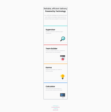
Hi,
Nice work with 2X2 on tablets. Regarding your question. You can remove
top: 25%;on supervisor and calculatorand just add the
align-items: center;to.feature-sectionLet me know if it works out.
You can make this challenge more interesting by adding some interactivity to the cards like a hover effect and also making each card a link. They are supposed to lead somewhere, right? Good Luck.
Marked as helpful - @alexmercer500@BikeInMan
Hey, nice work so far.
In the
.parayou have used <br> to break the line. <br> is not meant for styling but for breaking lines where appropriate, like in addresses etc. Instead you may also usemax-inline-sizeto control the length of a line inptags.Card titles are of different color than design. Intentional?
You can make this challenge more interesting by adding some interactivity to the cards like a hover effect and also making each card a link. They are supposed to lead somewhere, right?
If you can push yourself a little more, you may even try to display 2x2 cards on tablet sizes.
Good Luck.
- @juliflorezg@BikeInMan
The design on desktop seems to be very close to the design. Congratulations.
Some suggestions about markup.
-
top-infoshould be wrapped in aheaderand notarticle -
h2, h1 is the not the right order. Here you seemed to have used it only for sizing. h1, h2 are not meant for sizing but for section headings in long form articles. You could have wrapped both the lines in
h1and one of them inspaninside it and stylespanseparately. -
About card titles,
spanis not the right element. May be h2 or h3 is better.spanis mostly used in between long sentences and you briefly want to accent few words inside it.
Other suggestions.
- Some padding is required on the sides on tablet sizes. Now it overflows.
You can make this challenge more interesting by adding some interactivity to the cards like a hover effect and also making each card a link. They are supposed to lead somewhere, right?
If you can push yourself a little more, you may even try to display 2x2 cards on tablet sizes.
Good Luck.
Marked as helpful -
- @Axurynn@BikeInMan
The design on desktop seems to be very close to the design. Congratulations.
I have the following comments for you, if you will.
You should not use div to wrap text. Div is mostly used to group of elements and to style it. .cardTitle, .cardP should be changed to standard html elements like
h2andp.Cards stretch the whole screen on smaller than desktop sizes. Try using
max-width(about 300px) on your cards.You can make this challenge more interesting by adding some interactivity to the cards like a hover effect and also making each card a link. They are supposed to lead somewhere, right?
If you can push yourself a little more, you may even try to display 2x2 cards on tablet sizes.
Hope you enjoyed doing this challenge. For me, it took a lot of time and a lot of trial and error.
Good Luck.
Marked as helpful - @kentmichael@BikeInMan
Nice work, with the whole design in one grid.!
- @cholis04
Advice Generator using Next.js, Axios and styled-component
#accessibility#axios#next#styled-components#typescript@BikeInManso cool..
- @vanderms@BikeInMan
Beautiful. Nice work as always.
May be you can add a link to the logo and make 'Try it free' a little more interactive. It seemed to too subtle to be noticed.
Link to your portfolio is a nice idea. :)
Marked as helpful - @NickODxyz@BikeInMan
Very cool. Matches the design almost 100%. How did you do that ? Whats your technique?
- @xchen1778@BikeInMan
Wow, you have done some.pretty cool stuff with a single grid. Works well in both sizes. Awesome.
- @juniorrdgs@BikeInMan
Wow, you have given color to the scrollbars and styled them too. Very creative idea! Looks nice and works well. Great work.
- @viniciusdsv93@BikeInMan
Nice work ! Works well.
You can make it much simpler by apply on
align-items: center;oncontainer-cardsand removing all other flexs on 3 columns. A little margin under red box would get you the same result. Just a thought. I am always looking to work with as much less code as possible.Marked as helpful - @ikennaezef@BikeInMan
Pretty Impressive ! Congratulations.
- @NickODxyz@BikeInMan
Hi Nick,
You have completed some impressive challenges and far ahead in the game. And for some strange reason you decided to follow me :) I am honored.
Senior Analyst to Frontend ? Must be a difficult decision. But you seem to enjoy this a lot. Somewhat same here.
Good Luck.
- @MazzGuille@BikeInMan
100days of Coding? Interesting ! How many hours do you plan to work/code? What are you planning to develop ?