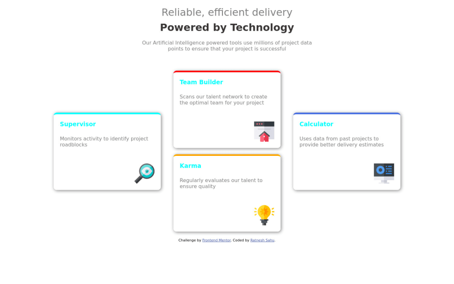
Design comparison
Solution retrospective
HI I'd appreciate any valuable feedback, It'd would be very helpful to provide correction and more easy approachable and cleaner way for the design.
Community feedback
- @BikeInManPosted over 2 years ago
Hey, nice work so far.
In the
.para
you have used <br> to break the line. <br> is not meant for styling but for breaking lines where appropriate, like in addresses etc. Instead you may also usemax-inline-size
to control the length of a line inp
tags.Card titles are of different color than design. Intentional?
You can make this challenge more interesting by adding some interactivity to the cards like a hover effect and also making each card a link. They are supposed to lead somewhere, right?
If you can push yourself a little more, you may even try to display 2x2 cards on tablet sizes.
Good Luck.
1@alexmercer500Posted over 2 years ago@BikeInMan Thanks for the Feedback and notes, I am fairly new to this, and still figuring things out. It'd be nice if you provide notes and feedback on my other works too.
0@BikeInManPosted over 2 years ago@alexmercer500 sure, but I only comment on challenges that I have personally attempted.
0
Please log in to post a comment
Log in with GitHubJoin our Discord community
Join thousands of Frontend Mentor community members taking the challenges, sharing resources, helping each other, and chatting about all things front-end!
Join our Discord