Design comparison
SolutionDesign
Solution retrospective
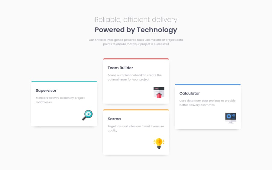
First time using CSS GRID and still learning, any feedback is well appreciated.
Community feedback
- @BikeInManPosted about 3 years ago
Hi,
Nice work so far. Desktop design is close to the requirements.
However, on small screen sizes, there are a couple of problems. The first card is missing border color on top. And there is no gap/margin between cards.
Also, on tablet sizes. The cards seem to stretch all the way to the sides. To prevent this consider setting a max-width on cards. eg:
.card-content {
max-width: 300px;
margin: 10px;
}
Good Luck
Marked as helpful0
Please log in to post a comment
Log in with GitHubJoin our Discord community
Join thousands of Frontend Mentor community members taking the challenges, sharing resources, helping each other, and chatting about all things front-end!
Join our Discord
