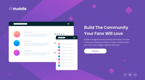
Submitted almost 4 years agoA solution to the Huddle landing page with a single introductory section challenge
Huddle Landing Page | Flexbox | Responsive

@NickODxyz
Solution retrospective
Hi all,
Just a couple of questions on this one please. Would be great to hear your feedback.
1 - I played around with min & max for things like font-size and my .logo to make it responsive. Is this a good practice at all? Or should I just hard code the changes in my media queries?
    width: max(120px, 14.71%);
}```

2 - Given that I get the figma drawings, is it best to actually hard code the paddings into my `.wrapper` class the way I do? As I use it to set out where elements start / end. When ever I come to the complete 1440 desktop version, I'm always off and have to play around with them a bit.

I'm juist wondering how the professionals would tackle responsive mobile first workflow knowing the desktop version needs to be a certain size.

Thanks again for all comments.

Nick
Code
Loading...
Please log in to post a comment
Log in with GitHubCommunity feedback
No feedback yet. Be the first to give feedback on Nick OD's solution.
Join our Discord community
Join thousands of Frontend Mentor community members taking the challenges, sharing resources, helping each other, and chatting about all things front-end!
Join our Discord