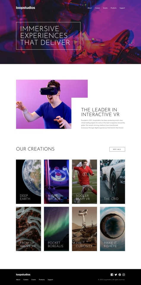
@VCaramesSubmitted over 1 year ago
The challenge was pretty straightforward and a great way to practice responsive images and overlapping content.
The "Creations" section required the most attention, as I wanted the entire image to be "clickable" and be accessible, while also applying gradient-background to the image.
To make things easier to manage, I decided to implement each creation item as a JSON and then render it as list using map().
After that I "overlapped" the links and images on top of one another using CSS Grid:
  &__item {
    display: grid;
    grid-template-areas: "stack";

    & > * {
      grid-area: stack;
    }
  }
For the layout, I used grid-template-columns and simply changed the layout during certain breakpoints.
To make the entire image "clickable" I used Andy Bell's method of doing so:
More details provided in the GitHub README...
As always, all feedback to better improve this challenge is greatly appreciated! ♥️


