


@RoyaltechsisSubmitted 8 months ago
Latest solutions
MovieDB fullstack app - Supabase, Vite, Sass, BEM, Swiper, Serverless
#accessibility#bem#supabase#vite#sass/scssSubmitted 9 months agoSpace tourism website with parallax effect using GSAP, Vite, Sass, BEM
#bem#gsap#sass/scss#viteSubmitted 12 months agoE-commerce product page - Glide.js, Vite, Sass, BEM
#bem#sass/scss#vite#accessibilitySubmitted about 1 year agoTwo-page art gallery using GSAP, Leaflet, Vite, Sass, BEM
#accessibility#bem#gsap#sass/scss#viteSubmitted about 1 year agoDesign portfolio using grid, sass, BEM, mobile first, flexbox
#accessibility#bem#sass/scssSubmitted about 1 year agoNews homepage - Sass, BEM, Mobile first, accessible mobile navigation
#accessibility#bem#sass/scssSubmitted about 1 year ago
Latest comments
- @tedikoPosted 8 months ago
Hi!
You should not use
create-react-appto setup and start your React projects. It is no longer recommended by React developer team and was removed from the official documentation. CRA has problems with its performance. It is slow and bulky compared to the modern methods. It also is outdated as the dependencies themselves suffer from warnings during installation. There are few alternatives. I personally use Vite, which I recommend.We shouldn't manipulate the DOM directly. React is all about being declarative and so manually selecting DOM elements, manipulating them and attaching event listeners like you did in
<NavBar>component is not really the React way of doing things. React utilizes a Virtual DOM to optimize updates to the actual DOM do direct manipulating can interfere with this process, leading to inconsistencies between virtual DOM and the actual DOM. This can cause unexpected behavior, visual glitches and bad performance. Additionally, React components have a lifecycle that dictates when they mount, update, and unmount. Directly manipulating the DOM can disrupt this lifecycle, making it difficult for React to manage component states and updates correctly. For instance, if you remove a DOM element directly, React may not be aware of this change, leading to errors trying to re-render that component. Instead of manipulating DOM directly and usinguseEffectto handle that side effect you should create local state for that component usinguseStatehook and later on whenever your menu is toggled change that state with event handler using setter function.const [isMenuOpen, setIsMenuOpen] = useState(true); function handleToggleMenu() { setIsMenuOpen(prevIsMenuOpen => !prevIsMenuOpen); }And with that, you can attach event handler to your menu button like so:
<button
    className="text-gray-700 focus:outline-none focus:text-blue-600"
    onClick={handleToggleMenu}
>
And to make it work, you have to conditionally add class names for mobile-menu within your JSX.
<div
    id="mobile-menu"
    className={`${isMenuActive ? '-translate-y-full translate-y-0' : ''}`}
 >
Changing
isMenuActivestate withhandleToggleMenuevent handler will trigger re-render of the component which will generate new JSX with updated classes.In components where you are returning single DOM element you don't have to wrap returned JSX in
<></>.<Fragment>lets you group elements without a wrapper node.Have fun!
Marked as helpful0 - @laura-nguyenSubmitted 9 months agoWhat are you most proud of, and what would you do differently next time?
I utilized grid-template-areas to create the perfect grid layout for the desktop view. I also timed myself while working on this component and was able to complete it in 1.5 hours, which was faster than I had anticipated. I chose to time myself in order to improve my time management skills and practice working under pressure.
What challenges did you encounter, and how did you overcome them?The cards don't have the same height as each other so initially the grid looked very jumbled. I fixed this by setting the height to 100% on the cards.
What specific areas of your project would you like help with?I would love to learn another efficient way to achieve this grid layout.
@tedikoPosted 9 months agoHello @laura-nguyen! The reason why you need to explicitly set height to 100% on the cards is because of how you set your grid container in first place. The fr unit allows us to define grid tracks as fractions of the available space which means if a grid container has 2 rows with 1fr each, they will each take up an equal amount of space, i.e., each row will be 50% of the available space. You're defining
grid-template-rows: repeat(2, 1fr);so both of your rows take up equal amount of space, and since your first row card content is bigger than second row cards it will still divide them with equal amout of space leaving second row with cards jumbled as you said. Instead what you want to use ismin-contentkeyword which is the smallest size a box can take without overflowing its content - like so:grid-template-rows: repeat(2, min-content). This way, your second row will be as small as your largest card in that row. Now you can removeheight: 100%from.cardcontainer and from.card--5where you setheight: 100%andautowithin some breakpoint. Last thing you need to do is removealign-items: flex-startbecause it is doing excatly what you want to avoid.align-items: flex-startaligns items to be flush with the start edge of their cell and instead you want to fill the whole width of the cell withalign-items: stretch. But since stretch is default behaviour (align-items: normal) you don't have to explicitly set that, just remove old property.Since you're using
display: gridfor<main>on desktop you should be consistent and also usegridon mobile instead offlex. Why switch between the two if one can do excatly the same?Have fun!
Marked as helpful0 - @mardon1devSubmitted about 1 year agoWhat are you most proud of, and what would you do differently next time?
This challenge takes time because of the hovering effect and responsive design.
What challenges did you encounter, and how did you overcome them?Correct placing of contents
What specific areas of your project would you like help with?Responsive design, I think
@tedikoPosted about 1 year agoHello @mardon1dev
Congrats on finishing another project! Here is my feedback:
<main>is a block-level element so it takes up horizontal space by default. There is no need to setwidth: 100vhto it. It stretches 100% wide by default.- Use
min-height: 100vhinsteadheighton<main>element. By doing this your element will be at least 100% of the browser height but can be bigger if needed. - You shouldn't set height on
.cardcomponent. Instead let your inner content decide how much space it need and how high your container will be. - Text should never be in
spanordivalone. Always use meaningful element. Change.card-learningand.card-publishto the appropriate elements. - Never use pixels for font-size's. Instead use rem which is relative to font-size of the root element (most browsers set it to 16px). Defining your elements font-size in pixels will not respect the user's font-size preferences and therefore your web page will not be user-friendly.
- Usually
line-heightis written as a unitless value, like 1.5.
Have fun!
Marked as helpful4 - @TheWichaSubmitted about 1 year agoWhat are you most proud of, and what would you do differently next time?
ill use tailwind for sure next time
What challenges did you encounter, and how did you overcome them?none
What specific areas of your project would you like help with?none in this case
@tedikoPosted about 1 year agoHi Daniel!
You did great! Here are some tips from me:
- By default all web browsers apply a certain amount of default styling to HTML documents eg. h1 are larger that h3, links are blue and underlined etc. These browser defaults don't go away when you add your custom stylesheet to a document. Reduce browser inconsistencies in things like default line heights, margins and font sizes of headings, and so on by using CSS Reset (e.g by Andy Bell)
- Now that you added some CSS Reset your
bodyelement doesn't have defaultmarginso your.cardstick to screen edges on mobile screen size devices. Addpadding: 1remor so to yourbody. - Change body to take
min-height: 100vh. 100vh means that the initial body height will take 100% of the viewport height, whereas the use of min-height instead of height will let the body element grow even more if necessary. - Your document lacks landmarks. Landmarks are a group of HTML tags and roles that define different subsections of a website and help navigate through a website. Your
.cardcontainer should be<main>element. - Since
.article-imgis decorative and decorative images do not need to be announced by the screen reader, leave thealtattribute emptyalt=""so it will not be announced to the user. - Text should never be in
divorspanelements alone. Always use a meaningful element. Change.labeldiv and.user-infospan to paragraph (<p>) element. - Your page is lacking
<h1>element. h1 represent the main heading/subject for the whole app. Also, do not skip heading levels - start with<h1>, then use<h2>, and so on. Either switch your.card h2toh1or you can addh1element for your app and hide it with.sr-onlyclass since your app doesn't have title.
Happy coding!
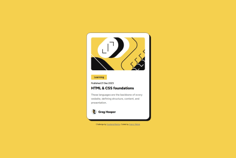
Marked as helpful0 - P@francimelinkSubmitted about 1 year agoWhat are you most proud of, and what would you do differently next time?
Basically, the project was mainly aimed at the basics of HTML structure and CSS itself. Mistakes are still possible as I am basically still a beginner.
What challenges did you encounter, and how did you overcome them?As I mentioned above, the project served as a basis for me. I had no particular problems with the project itself
What specific areas of your project would you like help with?I definitely want to progress in HTML structuring itself, because I still often find myself editing the HTML structure itself. I think this would be a good base when I go on to more difficult projects
@tedikoPosted about 1 year agoHello @francimelink!
Good job on this challenge. Some things I'd change:
- The
<header>should not be included inside the<main>tag. When a <header> is nested in <main> , <article> , or <section> , it just identifies it as the header for that section and isn't a landmark. Adding loads of headers in sub sections or inside landmarks creates a load of unwanted noise for assistive tech users and means you then have to label every section and header. - You shouldn't define
font-sizein your body element and certainly not in pixels. Browsers set the HTML font size to 16px by default. Defining yourbodyelement font-size in pixels will not respect the user's font-size preferences and therefore your web page will not be user-friendly. - You shouldn't use
<button>for "learning" label. Buttons are to be used for performing an in-page action, trigger some action. This is just some text with styles. - Author avatar should contain
altattribute since it isn't decorative image. You shouldn't hide it witharia-hiddenattribute. - Change body to take
min-height: 100vh. 100vh means that the initial body height will take 100% of the viewport height, whereas the use of min-height instead of height will let the body element grow even more if necessary.
Happy coding!
Marked as helpful1 - The
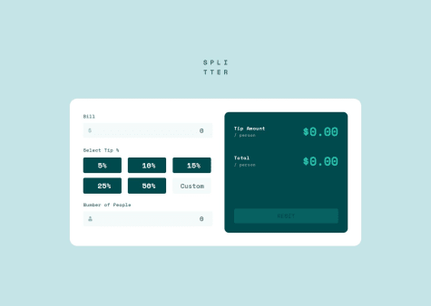
- @tloxiuSubmitted about 1 year agoWhat specific areas of your project would you like help with?
When I checked the preview of phones on my PC in web dev tools everything works fine, but when I am checking it on my phone, elements are broken, and out of their place, I will be looking into this, but if anyone have an idea, I will be happy to listen to that! :)
@tedikoPosted about 1 year agoHi @tloxiu!
Congrats on finishing another project! Here is my feedback:
- Your logo image conveys no important information necessary for the user to understand the page content so it should be decorative. Keep
altattribute empty or wrap your logo withaelement so it point's to home page like your alt text is saying. - You should add
text-align: rightfor your.input-billand.input-people-numberinputs instead of adding odd padding like you did (padding: 0.4rem 0 0.4rem 17rem;). If user input is long enough it will cut it since there is no space (i know it won't be case in this scenario but it is just bad practice). - I am using Firefox and in your inputs there are arrows. Find a way to remove them to match design.
- I believe using buttons for selecting tip is just wrong. Instead you should use
inputwithtype="radio"and the custom tip should be a radio input that when selected reveals ainput type="number". - It is hard to use your solution with keyboard. First of all you should add some
:focus-visiblestyles for focused elements. Then it'd be nice to "calculate" when user click enter in last input field. Now it only calculates when i click on selected tip %. - There is a bug when i input numbers like: bill: 66, num of people: 3 and click on 15% tip, the output is: $3.3000000000003 and it should be fixed to two points after decimal point.
- Using the
!importantrule in CSS is generally considered to be bad practice because it overrides all other styles. You probably did something wrong if you have to use it.
Happy coding!
Marked as helpful0 - Your logo image conveys no important information necessary for the user to understand the page content so it should be decorative. Keep