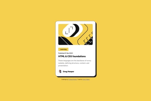
Blog preview card trainig accessibility and CSS basics
Design comparison
Solution retrospective
Basically, the project was mainly aimed at the basics of HTML structure and CSS itself. Mistakes are still possible as I am basically still a beginner.
What challenges did you encounter, and how did you overcome them?As I mentioned above, the project served as a basis for me. I had no particular problems with the project itself
What specific areas of your project would you like help with?I definitely want to progress in HTML structuring itself, because I still often find myself editing the HTML structure itself. I think this would be a good base when I go on to more difficult projects
Community feedback
- @tedikoPosted 9 months ago
Hello @francimelink!
Good job on this challenge. Some things I'd change:
- The
<header>
should not be included inside the<main>
tag. When a <header> is nested in <main> , <article> , or <section> , it just identifies it as the header for that section and isn't a landmark. Adding loads of headers in sub sections or inside landmarks creates a load of unwanted noise for assistive tech users and means you then have to label every section and header. - You shouldn't define
font-size
in your body element and certainly not in pixels. Browsers set the HTML font size to 16px by default. Defining yourbody
element font-size in pixels will not respect the user's font-size preferences and therefore your web page will not be user-friendly. - You shouldn't use
<button>
for "learning" label. Buttons are to be used for performing an in-page action, trigger some action. This is just some text with styles. - Author avatar should contain
alt
attribute since it isn't decorative image. You shouldn't hide it witharia-hidden
attribute. - Change body to take
min-height: 100vh
. 100vh means that the initial body height will take 100% of the viewport height, whereas the use of min-height instead of height will let the body element grow even more if necessary.
Happy coding!
Marked as helpful1@francimelinkPosted 8 months ago@tediko
Thank you very much for your comment and for all the suggestions.
In this example, I used a height of 100vh because it is only one element on the whole page. Otherwise, I would use min-height.
0 - The
Please log in to post a comment
Log in with GitHubJoin our Discord community
Join thousands of Frontend Mentor community members taking the challenges, sharing resources, helping each other, and chatting about all things front-end!
Join our Discord