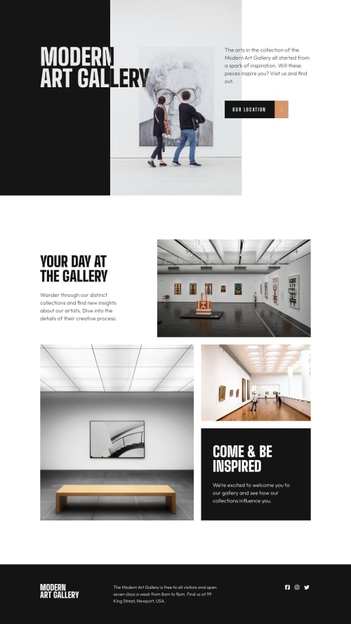
Two-page art gallery using GSAP, Leaflet, Vite, Sass, BEM

Solution retrospective
Hello! 👋
This project was nothing but fun! I found many challenges in this project, such as creating a two-page website, using external Leaflet library to display the map or trying GSAP library to make scroll animations (this project turned out to be a great place to do it!). By using the Leaflet and GSAP libraries, I had to learn and use JavaScript bundler. Originally I created the project using Webpack to bundle my JavaScript files. But while reading more about diffrent bundlers or tools I wanted to check what the working process with other ones looks like. I switched Webpack with Vite (you can check #1 PR in github). Surprisingly there weren't many problems when changing. The Vite is simple to configure, which is minimal.
Instead of adding a container to each section that limits our content to a certain width and positions it in the middle of the screen, leaving us the option for the parent element to still have the value of the entire width of the page if we wanted to add a background or photo, I used CSS layout grid breakouts, which gets rid of redundant unnecessary containers by defining the grid and its columns template for main grid-container.
ScrollTrigger animations using GSAP are disabled for users who have set prefers-reduced-motion. Additionally, I created a fallback if javascript was not loaded so that the "initial settings" of the animation would not be loaded. Animations are disabled on mobile devices. A similar fallback has been added for the Leaflet #map container. If javascript does not load, the container will not be displayed at all so as not to leave empty space on the page.
I added skip-to-content links, even though they weren't really needed in this case, I happened to see an article about them so I decided to use them.
💡Here's some new things I used or learned:
- GSAP library - GSAP is a JavaScript library for building high-performance animations that work in every major browser.
- Leaflet library - Leaflet is the leading open-source JavaScript library for mobile-friendly interactive maps.
- Font Awesome - Font Awesome is the icon library and toolkit.
- Webpack - Webpack is a module bundler. Its main purpose is to bundle JavaScript files for usage in a browser, yet it is also capable of transforming, bundling, or packaging just about any resource or asset.
- Vite - Vite is a build tool that aims to provide a faster and leaner development experience for modern web projects. It consists of two major parts: a dev server, and build command that bundles your code with Rollup.
- CSS layout grid breakouts - Page layout structure using CSS Grid to get rid of redundant unnecessary containers.
- prefers-reduced-motion - The
prefers-reduced-motionis used to detect if a user has enabled a setting on their device to minimize the amount of non-essential motion. The setting is used to convey to the browser on the device that the user prefers an interface that removes, reduces, or replaces motion-based animations. - skip-to-content link - Skip links are little internal navigation links that help users move around a page. They’re often hidden from view and used as an accessibility enhancement that lets keyboard users and screen readers jump from the top of the page to the content without have to go through other elements on the page first.
🛠️Build with: (can be found also in my others projects)
- Sass CSS pre-processor. Sass is a stylesheet language that’s compiled to CSS. It allows to use variables, nested rules, mixins, functions, and more, all with a fully CSS-compatible syntax. Sass helps keep large stylesheets well-organized and makes it easy to share design within and across projects.
- Sass file structure called 7-1 Pattern. It offers great way to modularize Sass file structure and help keep things easier to maintain. It's all about having everything in order so it is easier to work with code.
- Reduced browser inconsistencies in things like default line heights, margins and font sizes of headings, and so on by using CSS Reset by Andy Bell
- BEM - Block, Element, Modifier methodology, which is a popular naming convention for classes in HTML and CSS. BEM is useful when it comes to larger, more complex projects when code organization becomes crucial. The idea behind it is to speed up the development process, and ease the teamwork of developers by arranging CSS classes into independent modules.
- CSS Grid. Grid is a powerful tool for creating two-dimensional layouts on the web.
❓Questions:
- Any suggestions on how I can improve are welcome!
Please log in to post a comment
Log in with GitHubCommunity feedback
No feedback yet. Be the first to give feedback on tediko's solution.
Join our Discord community
Join thousands of Frontend Mentor community members taking the challenges, sharing resources, helping each other, and chatting about all things front-end!
Join our Discord