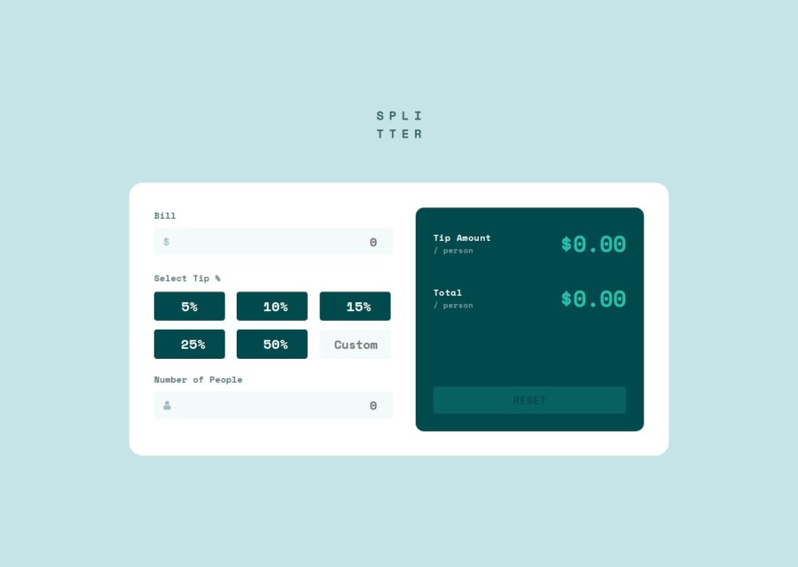
Frontend Development Workflow of Tip Calculator App
Design comparison
Solution retrospective
When I checked the preview of phones on my PC in web dev tools everything works fine, but when I am checking it on my phone, elements are broken, and out of their place, I will be looking into this, but if anyone have an idea, I will be happy to listen to that! :)
Community feedback
- P@tedikoPosted 10 months ago
Hi @tloxiu!
Congrats on finishing another project! Here is my feedback:
- Your logo image conveys no important information necessary for the user to understand the page content so it should be decorative. Keep
altattribute empty or wrap your logo withaelement so it point's to home page like your alt text is saying. - You should add
text-align: rightfor your.input-billand.input-people-numberinputs instead of adding odd padding like you did (padding: 0.4rem 0 0.4rem 17rem;). If user input is long enough it will cut it since there is no space (i know it won't be case in this scenario but it is just bad practice). - I am using Firefox and in your inputs there are arrows. Find a way to remove them to match design.
- I believe using buttons for selecting tip is just wrong. Instead you should use
inputwithtype="radio"and the custom tip should be a radio input that when selected reveals ainput type="number". - It is hard to use your solution with keyboard. First of all you should add some
:focus-visiblestyles for focused elements. Then it'd be nice to "calculate" when user click enter in last input field. Now it only calculates when i click on selected tip %. - There is a bug when i input numbers like: bill: 66, num of people: 3 and click on 15% tip, the output is: $3.3000000000003 and it should be fixed to two points after decimal point.
- Using the
!importantrule in CSS is generally considered to be bad practice because it overrides all other styles. You probably did something wrong if you have to use it.
Happy coding!
Marked as helpful0@tloxiuPosted 10 months agoHello again. Thanks a lot for your help, I will implement the changes when I find the time! :) @tediko
0 - Your logo image conveys no important information necessary for the user to understand the page content so it should be decorative. Keep
- @ad-monir2001Posted 10 months ago
I need your help how can i reach you Roksana?
0@tloxiuPosted 10 months agoHello! You can reach me on discord - tlox., I'm on frontend mentor discord too :) @ad-monir2001
1@ad-monir2001Posted 10 months ago@tloxiu I have knocked you on discord . view please
0
Please log in to post a comment
Log in with GitHubJoin our Discord community
Join thousands of Frontend Mentor community members taking the challenges, sharing resources, helping each other, and chatting about all things front-end!
Join our Discord
