Design comparison
Solution retrospective
Hello there!
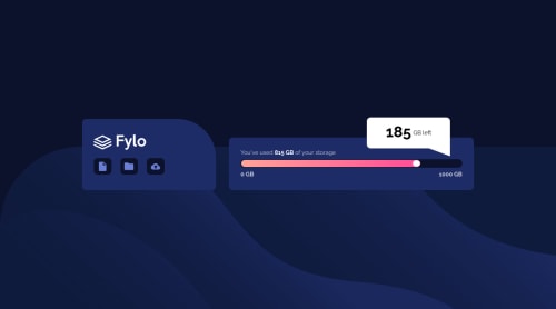
This time I think I did pretty good, even though I had no idea at the beginning on how to do the "185 GB left" detail, which I don't even know if I did ok. Is that the correct way?
Either way, all help is appreciated, and if you think I have some unnecessary code, let me know!
Thanks!
Community feedback
- @ApplePieGiraffePosted almost 2 years ago
Greetings, Feithers! 👋
Good effort on this challenge! 👍
I'd like to suggest taking another look at the responsiveness of your site. Currently, things look okay in the desktop layout, but as the size of the screen gets smaller the content begins to look a little squished and things start to break. Even if the desktop and/or mobile views of your site look good, it is important to make sure that your site looks great across all screen sizes so that as many people as possible can enjoy your work. If you’d like to learn more about how to make your site responsive, check out this helpful course or this one from web.dev is great as well.
Another approach to creating the "185 GB" popup would be to wrap it in a container like this:
<div class="popup-container"> <div class="popup-content"> content goes here... </div> <div class="popup-triangle"></div> </div>
Allow the container element to be sized by the content and use absolute positioning to position the triangle relative to the container. You can use the CSS clip-path property to make the triangle div into an actual triangle shape. 🙂
Hope you find this helpful. 😊
Keep coding (and happy coding, too)! 😁
Marked as helpful0
Please log in to post a comment
Log in with GitHubJoin our Discord community
Join thousands of Frontend Mentor community members taking the challenges, sharing resources, helping each other, and chatting about all things front-end!
Join our Discord