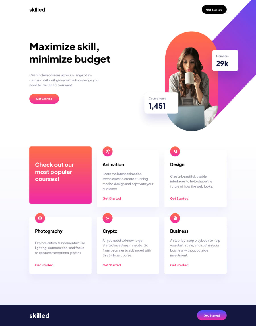
Design comparison
SolutionDesign
Solution retrospective
Any comment that can help me improve would be appreciated
Community feedback
- @ApplePieGiraffePosted almost 2 years ago
Hi, Rabbituz! 👋
Nice job on this challenge! 👏 Your solution looks good and is responsive! 👍
There is a horizontal scroll bar appearing along the bottom of the page because the image in the hero section of the page overflows the
bodyof the document quite a bit. You may want to addoverflow-x: hiddento thehtmlandbodyelements in order to prevent that from happening.And don't forget to add a title and favicon to your page. 😉
Hope you find this helpful. 😊
Keep coding (and happy coding, too)! 😁
Marked as helpful0
Please log in to post a comment
Log in with GitHubJoin our Discord community
Join thousands of Frontend Mentor community members taking the challenges, sharing resources, helping each other, and chatting about all things front-end!
Join our Discord
