Skip to content
Learning paths
Challenges
Solutions
Articles
Unlock Pro
Log in with GitHub
Profile
Overview
Solutions
16
Comments
4
R Hayes
@ryanthayes
Follow
All solutions
Submitted over 1 year ago
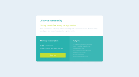
Responsive landing page using utility classes, custom variables, flex
HTML
CSS
0
4
0
Submitted over 1 year ago
Responsive landing page using Flex and Custom Variables
HTML
CSS
0
5
0
Submitted over 1 year ago
Responsive design using CSS variables, grid, flex, and utility classes
HTML
CSS
1
7
0
Submitted over 1 year ago
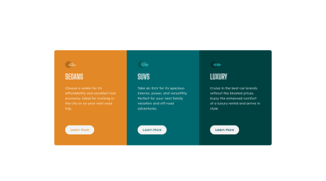
Responsive four card section using grid
HTML
CSS
0
4
0
Submitted over 1 year ago
Responsive grid using CSS grid and custom properties
HTML
CSS
0
2
0
Submitted over 1 year ago
Responsive card component using CSS grid
HTML
CSS
0
3
0
Submitted over 1 year ago
NFT Card Component with flex and ::before/::after overlay
HTML
CSS
2
7
0
Submitted over 1 year ago
Card component with flex
HTML
CSS
0
3
0
Submitted over 1 year ago
Responsive hero section with flex box
HTML
CSS
0
5
0
Submitted over 1 year ago
3 Column Section Responsive flex box
HTML
CSS
0
3
0
Submitted over 1 year ago
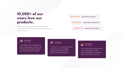
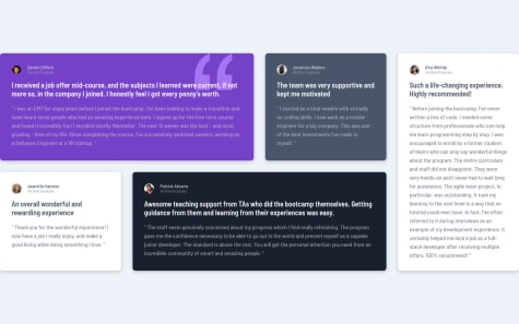
Responsive testimonial section using CSS grid
HTML
CSS
0
5
0
Submitted over 1 year ago
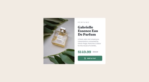
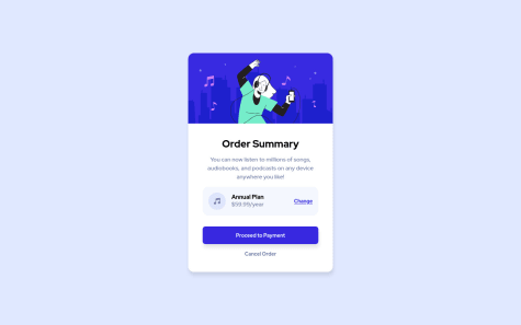
Preview Card Component with CSS custom variables
HTML
CSS
1
2
0
Submitted over 1 year ago
Testimonial section using CSS Grid
HTML
CSS
2
3
0
Submitted over 1 year ago
Summary component using CSS custom properties and data attributes
HTML
CSS
1
1
0
Submitted over 1 year ago
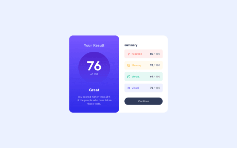
Results Summary Component using flexbox, css custom properties,
HTML
CSS
2
5
0
Submitted over 1 year ago
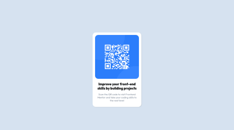
My Solution for the QR Component Challenge
HTML
CSS
5
8
0
