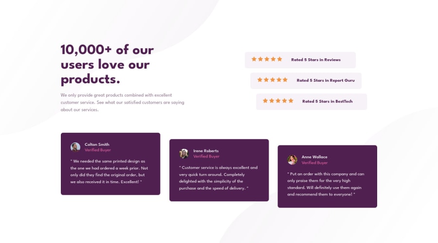


Design comparison

Solution retrospective
This one proved to be trickier than I first anticipated. The mobile design was pretty straightforward. It was when I started styling the desktop version that I hit some hiccups. I have gotten fairly confident with flex box, but I have minimal experience with grids. I tried to use ONE grid for the entire design. I struggled to get that to work for over an hour. I had no problem getting the first row aligned to the columns I wanted, but the "cards" on the second row I couldn't get out of the first column of the grid. I gave the scorn and third "cards" different grid-column-start, but they won't move. After many attempts I had no luck until I made the "cards" container its own grid. Seems like it should work as ONE whole grid for the design, I just couldn't come up with a working solution.
Outside of my issue with the gird, I have one thing I can't figure out. The star ratings not center aligned with the text. The have slightly more space below than above. I tried center-align: items. No luck. I tried vertical-align. No luck. I tried 0 padding. No luck. Any ideas?
Community feedback
Please log in to post a comment
Log in with GitHub
Join our Discord community
Join thousands of Frontend Mentor community members taking the challenges, sharing resources, helping each other, and chatting about all things front-end!
Join our Discord