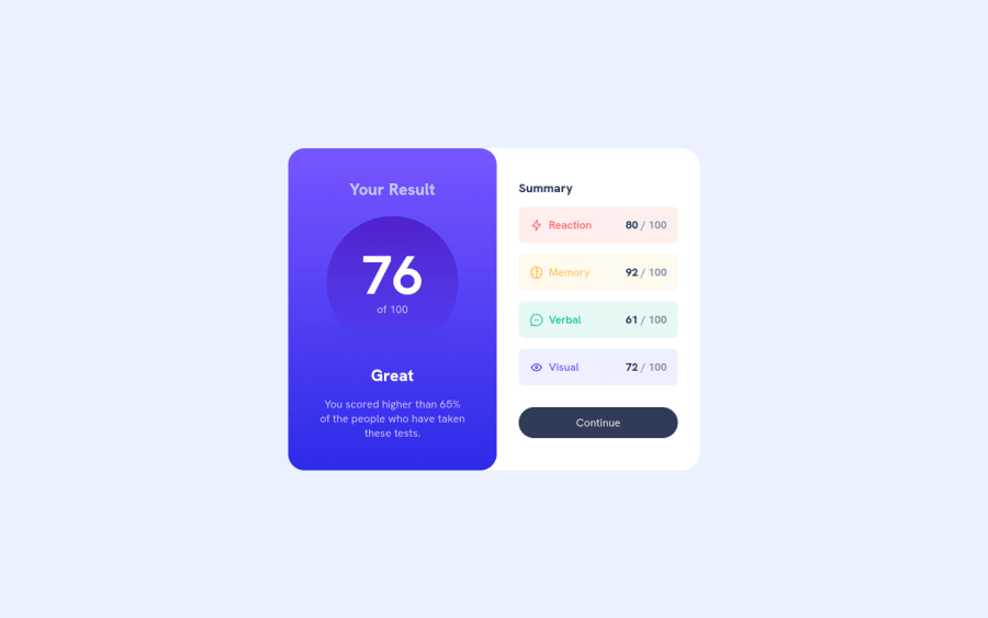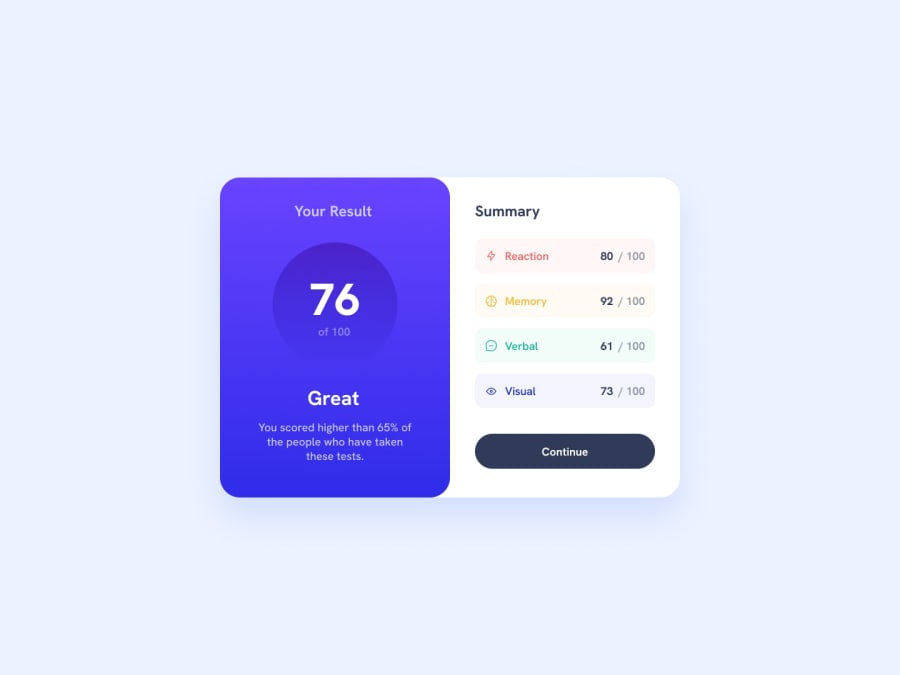
Results Summary Component using flexbox, css custom properties,
Design comparison
Solution retrospective
This one took me awhile. I may have overused flex box, but that is something I have been learning recently so it is what I went with. I need to practice with grids and learn the best practices for when to use either flex box or grid.
For the summary section I wasn't sure if each summary item was supposed to be a div or a list. I went with a UL. My first round of code I had classes for each list item (.reaction, .memory, etc.). It seemed liked a lot of extra classes. Then I remembered nth child, so I reviewed that and updated my code. I thought it made the HTML cleaner.
Community feedback
- @benjaminbilgehanPosted about 2 years ago
I suggest adding antialiased font smoothing to improve the clarity and sharpness of the text.
* {
  margin: 0;
  padding: 0;
  font: inherit;

/*  I suggest adding antialiased font smoothing to improve the clarity and sharpness of the text.  */
   -webkit-font-smoothing: antialiased;
    -moz-osx-font-smoothing: grayscale;
}
Additionally, in order to center them when viewed on mobile devices with a width of less than 500px, a margin has been added.
.results-summary {
  display: flex;
  flex-direction: column;
  align-items: center;
  background-color: var(--clr-white);
  margin:0 auto; /* Added this to center the content when viewed on mobile devices */
  max-width: 375px;
}
Marked as helpful1 - @0xabdulkhaliqPosted about 2 years ago
Hello there 👋. Congratulations on successfully completing the challenge! 🎉
- I have other recommendations regarding your code that I believe will be of great interest to you.
HEADINGS ⚠️:
- This solution had generated accessibility error report due to lack of level-one heading
<h1>
- Every site must want at least one
h1element identifying and describing the main content of the page.
- An
h1heading provides an important navigation point for users of assistive technologies, allowing them to easily find the main content of the page.
- So we want to add a level-one heading to improve accessibility by reading aloud the heading by screen readers, you can achieve this by adding a
sr-onlyclass to hide it from visual users (it will be useful for visually impaired users)
.
I hope you find this helpful 😄 Above all, the solution you submitted is great !
Happy coding!
0@benjaminbilgehanPosted about 2 years ago@0xAbdulKhalid Copying and pasting the same comment to everyone is unfair. I will report your profile to FrontendMentor. I have invested time in investigating their code and offering help, while you have been pasting the same comment to nearly everyone. Such behavior should not be tolerated by anyone, and I will certainly be reporting you.
0@0xabdulkhaliqPosted about 2 years ago@benjaminbilgehan
Brother these are the criteria to provide feedbacks:
- Does the solution include semantic HTML?
- Is it accessible, and what improvements could be made?
- Does the layout look good on a range of screen sizes?
- Is the code well-structured, readable, and reusable?
I provided my feedback for their accessibility issue, there's no copy pasting here. These comments are my own ideas. We want to expose the issue for these developers so why in next they don't do it, if we hesitate to note the mistake then they will do it again thats why i commenting without hesitation
Providing feedbacks is a user's own will, please don't interfere in others feedback. I don't plagiarized and I hope you will understand.
0@ryanthayesPosted about 2 years ago@0xAbdulKhalid
My understanding is that a PAGE is supposed to have only ONE <h1> tag, so I am confused on some of these frontend mentor projects. For example, this project is a COMPONENT, which would be part of a larger page. Most likely in an article or a section, right? Something reusable in a larger site. So, wouldn't the <h1> take within the component conflict with the <h1> tag that is most likely used as the title for the site/page?
0
Please log in to post a comment
Log in with GitHubJoin our Discord community
Join thousands of Frontend Mentor community members taking the challenges, sharing resources, helping each other, and chatting about all things front-end!
Join our Discord
