Submitted over 1 year ago
Responsive design using CSS variables, grid, flex, and utility classes
@ryanthayes
Design comparison
SolutionDesign
Solution retrospective
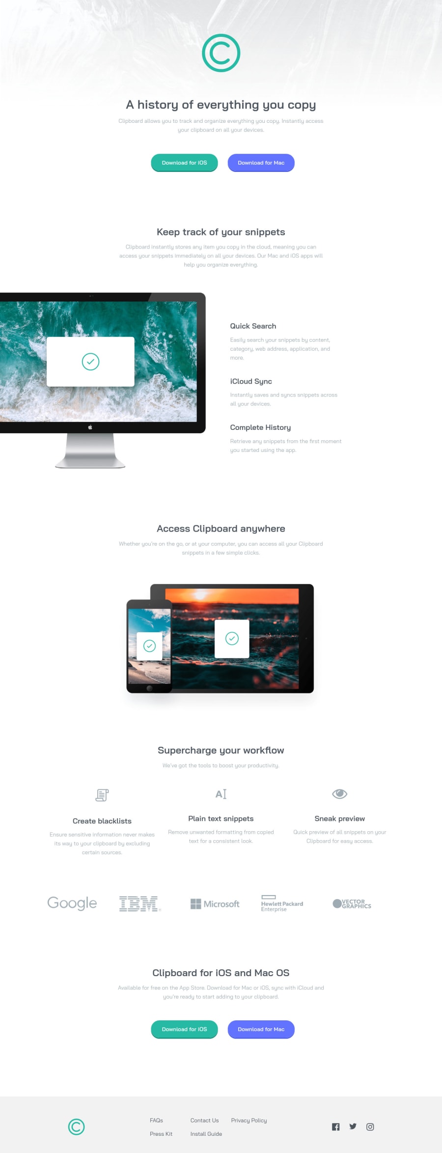
One section that I can't seem to figure out is how to perfectly center align the three columns under "Supercharge your workflow". I tried every kind of alignment (content, items, justify, self), but the first column is a couple of pixels lower. Grrr.
Community feedback
- @BagataaPosted over 1 year ago
Hello, congratulations on finishing the challenge, I reviewed your code and I fixed it by adding a height on icons now it's perfectly aligned. The first icon has an 88px height the other 2 icons are 80px height you can change the first item to 80px height and it will be perfectly aligned. I hope this helps you. HAPPY CODING
Marked as helpful0
Please log in to post a comment
Log in with GitHubJoin our Discord community
Join thousands of Frontend Mentor community members taking the challenges, sharing resources, helping each other, and chatting about all things front-end!
Join our Discord
