Submitted over 1 year ago
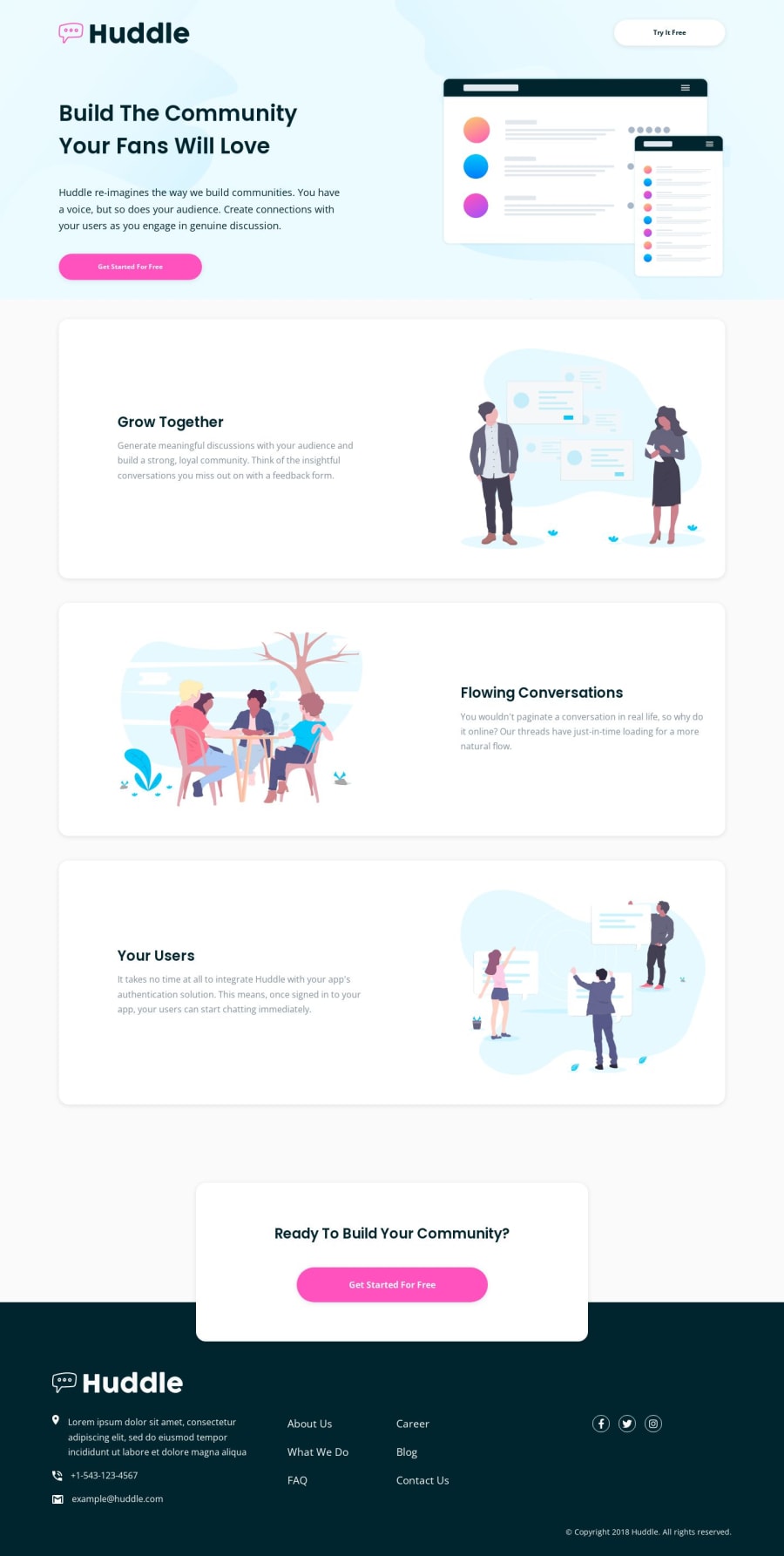
Responsive landing page using utility classes, custom variables, flex
@ryanthayes
Design comparison
SolutionDesign
Solution retrospective
In the design on the desktop version, the image in the Hero section is slightly larger than the content section. I wasn't sure how to do this. Looks like maybe the image should be 60% of the section and the content 40%, but I wasn't sure how to do that with CSS.
Community feedback
Please log in to post a comment
Log in with GitHubJoin our Discord community
Join thousands of Frontend Mentor community members taking the challenges, sharing resources, helping each other, and chatting about all things front-end!
Join our Discord
