


@BluordeSubmitted 7 months ago
Latest solutions
Product-preview-card with HTML and CSS
Submitted 7 months agoI struggle not setting fixed sizes for the card. I tried to use %. I could make it work for the mobile site but not for the desktop. Finally i left all with fixed sizes.
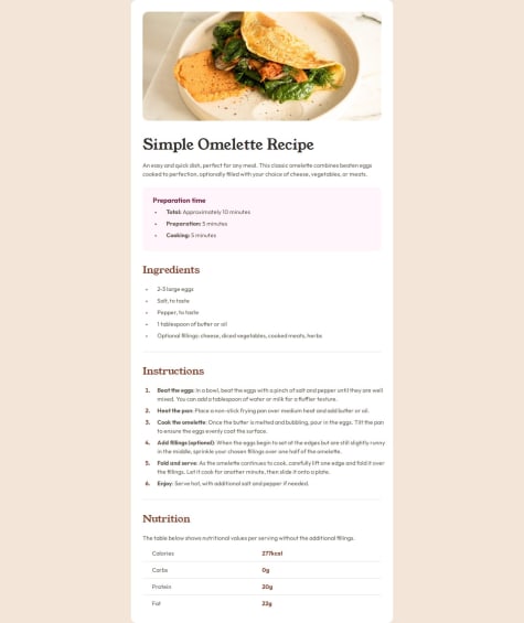
Recipe Page using HTML and CSS
Submitted 7 months agoI would like to know if the structure of the HTML is correct and if I used the corrects elements or should I be aware of something else.
Social Links Profiles using HTML and CSS
Submitted 7 months agoI am not sure if it is a best practice to set the width and heigth of the main card, specially in px that it is a fixed unit. But I don't know how to make it of the size that I want, in other way. Or when it is appropriate to use max-with.
Blog-preview-card with HTML and CSS
Submitted 7 months agoI am not sure which font-size measures are the best.
Faq-accordion using HTML, CSS and JavaScript
Submitted 7 months agoI would like to know wether I make a good use of the aria-expanded and control or not. And if it is indeed this what the challenge ask for. I am also in doubt with the background change from desktop to mobile. It was difficult to check if the transition from one to another is ok. And how indeed I can see the project in a mobile.
Latest comments
- @ldonnianniPosted 7 months ago
Hello @Bluorde! Great job. The sizes are a bit off, I couldn't do it with percentages so I used fixed sizes for my challenge, I can't help you in that regard. I saw that for the description of the product you used flexbox as well. I found it that it was not necessary in that section, without it I was able to have a better control on the margins and paddings in order to match the original design.
Marked as helpful0 - @imaginarygardenSubmitted 7 months ago@ldonnianniPosted 7 months ago
Hi @imaginarygarden! Great job, the styling within the article looks the same. You could add margin bottom and top in the article(I think is 8rem)and then it will be just like the original. You can use @media to style different sizes of screen. This way you can style for mobile(it is only the article) and for desktop. The recomendation usually is to style for mobile, and then with @media(min-width: 600px), for example you can modify only the elements you need. There are several tutorials about this in Youtube.
0 - @malak-ehabSubmitted 7 months ago@ldonnianniPosted 7 months ago
Great job! I would like to share some advice that someone recently gave me that it might help refinining some stuff.
Using a <main> tag inside the <body> of your HTML is a best practice because it clearly identifies the main content of your page. This helps with accessibility and improves how search engines understand your content.
For this challenge I used 2 containers, 1 for the users name and data, and a second one for the list of socials. It gave me at least more accurecy when I set the layout of the page, and to set the gap between elements.
For this challenge, I used also buttons at first and someone suggest me this (I change it and it works perfect)
Put these into a <ul> <li>, and the text should be wrapped with a <a> so it is accessible with a keyboard using the tab key, Using an <a> tag for navigation is semantically correct, improves accessibility for screen readers, and ensures consistent behavior across browsers, unlike a <button> or a <div> not intended for links.
@Stroudy also gave me this tip in regards of reseting the css Using a full modern CSS reset is beneficial because it removes default browser styling, creating a consistent starting point for your design across all browsers. It helps avoid unexpected layout issues and makes your styles more predictable, ensuring a uniform appearance on different devices and platforms, check out this site for a https://www.joshwcomeau.com/css/custom-css-reset/
Hope this helps you too
1 - @sawepeterSubmitted 8 months agoWhat are you most proud of, and what would you do differently next time?
I was able to write a CSS class with structure.
What challenges did you encounter, and how did you overcome them?Centering the image was quite and issue and spacing the contents.
What specific areas of your project would you like help with?The best method of spacing the contents(need advice).
@ldonnianniPosted 7 months agoHello @sawepeter. In regard of the third question... spacing the contents. What it works better for me is first do the layout, without worring about the specific style. Put a temporary border so I can understand better how things go together. In this case (blog-preview card) I used this structure <div class="card"> <img src="./assets/images/illustration-article.svg" alt="illustration"> <div class="card-content"> <h4 class="card-tag"> Learning </h4> <h5 class="card-date">Published 21 Dec 2023</h5> <h1 class="card-title">HTML & CSS foundations</h1> <p class="card-text">These languages are the backbone of every website, defining structure, content, and presentation.</p> </div>
<div class="user"> <img src="./assets/images/image-avatar.webp" alt="User Photo"> <p class="user-name">Greg Hooper</p> </div> </div>As parent a CARD, then as siblings a)the img, b)the content, that has children (tag, title, text) and finally c)user, with two children (img and name) First I centerd the card with display: flex. And then within the card I used flex as well to center the 3 siblings in column.
.card { background-color: white; border: 1px solid var(--gray-950); width: 384px; height: 522px; border-radius: 24px; box-shadow: 8px 8px 0 0 var(--gray-950); display: flex; flex-direction: column; align-items: center; justify-content: space-between; padding: 24px; }
Finally I centerd the children within the content as well. (so the tag, title and text is align also.) .card .card-content { width: 100%; display: flex; flex-direction: column; gap: 12px; }
Hope I was clear enough. Good luck!
0 - @malak-ehabSubmitted 7 months ago@ldonnianniPosted 7 months ago
Hello, you did a great job. I don't know if you are aware you can check style specifications in the downloads files, this way you can match better the colors and font. Also I think it is maybe better to put the reset of the CSS (margin, pading, box-sizing) for all the document like this (*{ margin: 0; padding: 0; box-sizing: border-box; } At least that is what I saw in several videos.
Marked as helpful0 - @ldonnianniSubmitted over 1 year ago@ldonnianniPosted over 1 year ago
Thanks for your feedback I tried them all! I don't quite get Body Section: To create some breathing space around the corners on smaller viewports, consider adding padding-inline: 24px to your body section. This will introduce a bit of white space and improve the overall visual appeal.
But I think is mostly because I don't understand entirely the workflow mobile-desktop.
0