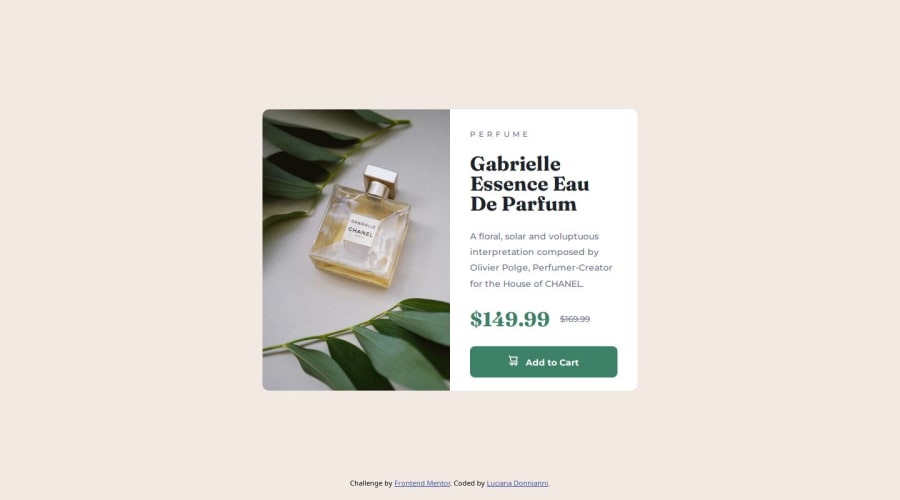
Design comparison
Solution retrospective
I struggle not setting fixed sizes for the card. I tried to use %. I could make it work for the mobile site but not for the desktop. Finally i left all with fixed sizes.
Community feedback
- @Fikerte-TPosted 7 months ago
Great solution!! Your solution looks with the design, great job. However, there is still room for improvement. for example
-
instead of giving those properties to the body, apply them to the main element. main { display flex align-items: center justify-content: center background-color: min-height: 100vh } and remove all the properties from body
-
its important to give min-height rather than fixed height so that your content can grow larger when it needs to.
-
also don't use fixed height for product-card
-
making the footer fixed affects user experience because it overlaps on your content. Remove position-fixed and adjust the style
Hope this helps. Happy coding
Marked as helpful0 -
Please log in to post a comment
Log in with GitHubJoin our Discord community
Join thousands of Frontend Mentor community members taking the challenges, sharing resources, helping each other, and chatting about all things front-end!
Join our Discord
