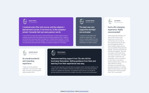
Testimonials grid section with SCSS

Solution retrospective
What I found difficult about this challenge was to make a smooth transition from desktop to mobile. I can set up the desktop grid but when it have to change to 1 column, i have some issue with inbetween dimensions.
I can't set properly the grid-container dimension, the items alwaays ended up surpasing its dimensions, making it difficult to manage. For example, in the mobile version, the Height, I have to do it by eye... if not I could not set the margin-bottom and the footer was over the last card.
Finally I try to use a function to change the color font according to the background @function set-text-color($color) { @if (lightness($color) > 40%) { @return $Very-dark-grayish-blue; } @else { @return $White; } }
Please log in to post a comment
Log in with GitHubCommunity feedback
No feedback yet. Be the first to give feedback on ldonnianni's solution.
Join our Discord community
Join thousands of Frontend Mentor community members taking the challenges, sharing resources, helping each other, and chatting about all things front-end!
Join our Discord