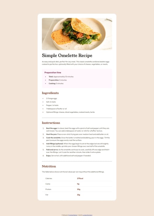
Design comparison
Solution retrospective
I am proud that I coud match the design. I would like to improve my workflow, naming conventions of the elements and to write a nice clean HTML and CSS.
What challenges did you encounter, and how did you overcome them?The most difficult part was to use the correct elements in the HTML that would make it more readable and easier to style in css. Not sure what can I improved.
What specific areas of your project would you like help with?I would like to know if the structure of the HTML is correct and if I used the corrects elements or should I be aware of something else.
Community feedback
- @grace-snowPosted about 1 month ago
There are some important learnings about html and css in this. At the moment its badly overflowing my phone screen on the sides because of mistakes in css. But most issues are likely to be in the html.
- the image needs a proper description that communicates the same value as the image itself. There are some great posts about this in the resources channel on discord.
- when importing fonts you don't need to repeat preconnect links. You can also combine families and weights into one main link instead of having two separate ones.
- there is no benefit at all to using all these sections. They basically act like divs when unlabelled (totally meaningless elements) so there is no reason to add them all. You get as much structure as you need from the headings. (Take note as well @MarenOelixtown )
- it's essential to use table header cells for the header content. It's also good to use the scope attribute set to row on these so it's clear they are row headings not column headings.
- the attribution should be in a footer landmark outside of main.
- make sure you update your attribution link to your frontend mentor profile url or github url.
- where did you get your css reset from? It looks a little unusual.
- I can't think why you need the container text div at all... The whole component should have padding. Child elements within it should only need vertical margins. Make sure you understand the difference between padding and margin
- the unnecessary min-width on the component is causing the bad overflow I'm seeing. This component should only have a max width in rem. You can give it a width 100% as well if you want to.
- don't nest css selectors unnecessarily. Keep css specificity low/flat. Place classes directly on what you want to style and stick to single class selectors as much as possible.
- if headings are styled the same give them all the same class!
- this challenge should only need one media query. And one max width in rem.
- I recommend you define media queries in rem or em not px so that the layout changes happen at the right time even for people who have a different text size setting.
Marked as helpful3 - @MarenOelixtownPosted about 1 month ago
congratulations, you have done a good job. 👍 You have already used very useful semantic HTML elements, such as ul, ol, table and section. With article you could possibly replace the recipe-card-div.
Good that you have defined responsive layouts from 505px and 1100px. A tip would be to work with mobile first approaches by defining smaller viewports by default and then overwriting them for larger viewports. all the best ✌️
keep it up
0
Please log in to post a comment
Log in with GitHubJoin our Discord community
Join thousands of Frontend Mentor community members taking the challenges, sharing resources, helping each other, and chatting about all things front-end!
Join our Discord