


@SunilBaghel002Submitted 6 months ago
Latest solutions
Newsletter-Signup-Form-with-success-message MDN Docs , resource page
#accessibilitySubmitted 6 months agousing of react and next js frame work and achieving this same result and all this is done with normal javascript only.
Javascript fundamentals Dom & event listners
#accessibility#bemSubmitted 6 months agoI’d appreciate suggestions on improving the accessibility of the share option and the overall page for users relying on keyboard navigation and screen readers. Although the CSS transitions work well, any advice on optimizing animations for smoother performance, particularly on lower-end devices, would be valuable. Any recommendations on cleaning up or optimizing my CSS and JavaScript structure, especially in handling interactive elements, would be very helpful.
Testimonials-grid-section css grid section row column layouts
#accessibility#bem#materialize-cssSubmitted 6 months agoCross-browser Compatibility to ensure consistent display. Accessibility Improvements for better screen reader support. Performance Optimization like lazy loading and CSS refinement. CSS Architecture advice on structuring scalable CSS for larger projects.
Four Card Feature section is build HTML & CSS Flex and Grid Column
#accessibility#bemSubmitted 6 months agoEnsuring that the layout adapts seamlessly to various screen sizes, particularly mobile and tablet views. Using CSS Grid or Flexbox for card positioning. You might want advice on which approach works best for responsive design in this scenario. Making sure the project adheres to accessibility standards (e.g., proper semantic HTML, keyboard navigation, ARIA labels). Ensuring good color contrast and readable fonts. Getting feedback on the chosen font sizes, spacing, and padding for consistency and readability. Improving code organization, such as separating concerns by using BEM methodology, modular CSS, or other best practices.
media queries , html , css and resourses page of multiple css & html
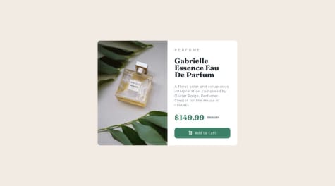
Submitted 7 months agoImplementing smooth transitions or micro-interactions to enhance user experience. Optimizing the use of JavaScript or CSS animations to ensure they don’t affect performance negatively. Gathering and integrating feedback to better understand how real users interact with the component and identify areas for improvement. If the product card involves dynamic data (like updating price, rating, or availability), handling state management or adding interactive elements (e.g., hover, click events) efficiently can be a challenge. React, Vue.js, or even plain JavaScript. Help with optimizing event listeners, DOM manipulation, or improving performance for animations/interactions would be beneficial.
Flexbox , responive css, visual-hidden-text , html,css.
#accessibilitySubmitted 7 months agoI’d like help with improving the performance of the card’s image load times, particularly for slower networks. Guidance on optimizing image formats and how to implement lazy loading would be helpful. Additionally, I'd appreciate some advice on best practices for accessibility, especially in terms of making sure the card is fully navigable and readable for screen readers.
Latest comments
- @burningbeattlePosted 6 months ago
The code is well-structured and functional, with a clean HTML layout, responsive CSS, and effective JavaScript validation. Here are the key points of feedback:
HTML: Well-organized and semantic, but consider wrapping the input and button in a <form> tag for better accessibility and functionality (e.g., enabling the "Enter" key for submission).
CSS: The design is responsive and flexbox is used effectively. However, consider refining breakpoints for better responsiveness and improving validation feedback by using CSS pseudo-classes like :invalid.
JavaScript: The validation logic works, but adding real-time feedback as users type and using the form's submit event (instead of button click) would enhance the user experience. Additionally, reset the form state when dismissing the success message.
Overall, a few tweaks to accessibility, validation, and form behavior will improve the project. Great job!
Marked as helpful0 - P@i-prkrSubmitted 7 months agoWhat are you most proud of, and what would you do differently next time?
I am glad that I was able to making the interaction more enjoyable with CSS transitions, and also that I am beginning to understand accessibility better and how to make solutions more accessible. Next time I need to make sure that I consider the build out for both size designs before structuring the HTML, I had to make some large changes part way through to make the layout change correctly.
What challenges did you encounter, and how did you overcome them?I had some challenges with the layout of the footer between the open and closed sharebar, wanting to make sure the share bar position did not move to make it appear cleaner. I had to play around with the HTML structure and padding on different elements until the content was aligned on the card footer and the share bar.
What specific areas of your project would you like help with?I would greatly appreciate some help with two things:
-
The CSS transition is not working correctly on the live site, but it works fine in the dev environment with parcel and I don't know why. On the live site, the position of the share bar before being opened is defaulting to the wrong location, so the transition is starting from the wrong place. In the large layout, it should start just below where it appears, but instead is starting from the middle of the card. In the small layout, it should scale up from the share button location. I don't know why it only works in local, I have tried using both the scss and css file for the parcel dev environment and both work fine, until it is deployed.
-
When I use a screen reader it won't read out anything more than the level on heading of 'article preview component', and I'm not sure why as I think I have my HTML structured correctly. Any suggestions to improve accessibility would be great too.
Any help would be greatly appreciated thank you for looking at my solution!
@burningbeattlePosted 6 months agoYour HTML code is well-structured and incorporates good practices for accessibility and responsiveness. By addressing the minor issues and implementing the suggested improvements, you can enhance the user experience, accessibility, and performance of your component. Always remember to test your changes across different browsers and devices to ensure consistency and functionality.
0 -
- @ownedbyanonymousSubmitted 7 months agoWhat are you most proud of, and what would you do differently next time?
I am proud that l could use the grid layout to create a responsive layout and that l am finally getting the hang of media-queries.
What challenges did you encounter, and how did you overcome them?I had challenges with the positioning of the quotation mark image in the first grid item/ testimonial. I still have knowledge gaps in the use of the absolute and relative values when dealing with the position property. Your feedback will greatly be appreciated!
What specific areas of your project would you like help with?- Use of absolute and relative values of the position property. (What was the best way to position the quotation mark image in the first testimonial)
- Are there areas l could refactor to avoid the use of media-queries. Your feedback will greatly be appreciated!
@burningbeattlePosted 6 months agoya this one is better than mine nyc work mate i struggled a lot doing this look like color schemes are not same as given in style guide . like gray box with gray text is not matching and is not good in design perspective .
0 - @SunilBaghel002Submitted 6 months agoWhat are you most proud of, and what would you do differently next time?
Next time, i would made more understandable website with better design
What challenges did you encounter, and how did you overcome them?I encounter challenges while making website responsive and overcome using flexbox and grid in css.
What specific areas of your project would you like help with?I like fully responsiveness in this website
@burningbeattlePosted 6 months agoSemantic HTML:
Use <article> or <figure> for each card to enhance semantics. Provide descriptive alt text for images. Accessibility:
Ensure color contrasts meet WCAG standards. Make sure all interactive elements (if any) are keyboard navigable. Use ARIA roles only when necessary. Responsive Layout:
Adopt a mobile-first approach using min-width media queries. Test across various devices and screen sizes. Ensure consistent spacing and sizing across breakpoints. Code Structure:
Implement BEM naming conventions for better scalability. Consolidate repetitive CSS rules. Organize CSS for readability, possibly using preprocessors. Adherence to Design:
Ensure pixel-perfect accuracy in font sizes, spacing, and element dimensions. Implement design-specific interactivity like hover effects. Correct file path typos (assets instead of assests). Optimize font loading by using <link> instead of @import. Use relative units (rem, em) for better scalability. Add transitions and hover effects to improve user experience. By addressing these areas, your project will not only be more robust and maintainable but also provide a better user experience across different devices and for all users, including those relying on assistive technologies.
0 - @WhitezerDSubmitted 7 months agoWhat are you most proud of, and what would you do differently next time?
This project was the most accurated and attention to the details as much as i could.
What challenges did you encounter, and how did you overcome them?-It's how to position elements when use media queries.
-How to use width on main object properly
-How to set proper line-height for bigger font size
What specific areas of your project would you like help with?From the challenges so here were the problems
- I have a problem to figure out how to make equal width of the two sections equal. -I have tried to use flex-grow for each one and set flex-basis to 0 but it doesn't work. -The solution i've use, i don't think it's the best approach. -What's the best way to adjust width on the element according to my project. and should use rem or em. because no matter what it was inherit from their parent (in this case was html) -I saw the proper line-height settings here : https://www.joshwcomeau.com/css/custom-css-reset/ and i use this for my css rules
- { line-height: calc(1em + 0.5rem); }
But the line height of my h1 was overlap. so i adjust it manually after CSS reset. So i still don't clear how to use this rule properly.
@burningbeattlePosted 7 months agojust a review done by chatgpt hence i am also nub in this hence reviewing code is more difficult than writing and understanding : ). all points are given by AI hence thanks for achieving the solution just similar to given
-
Removed unnecessary backslashes in @font-face declarations and recommended renaming font files to eliminate commas.
-
Ensured that class names in HTML and CSS match, especially after simplifying class names in the revised HTML.
-
Removed the invalid content: url() from .img-title and relied on the HTML <picture> element for responsive images.
-
Added word-wrap: break-word; and hyphens: auto; to .p__content to handle long words and improve text flow.
-
Changed the centering method from absolute positioning to Flexbox on the main container for better responsiveness and maintainability.
-
Added focus styles to the .btn--add-cart button and ensured semantic HTML by using a <button> element instead of an <a> tag.
-
Applied consistent BEM naming conventions across classes to enhance readability and maintainability.
-
Adjusted media queries to ensure elements scale appropriately on larger screens without relying on fixed widths.
-
Added box shadows, improved line heights, and added transition effects to enhance the visual appeal and user experience.
-
Added cursor: pointer; to buttons to indicate interactivity
By implementing these changes, your Product Preview Card Component will be more robust, accessible, and maintainable. Additionally, adhering to best practices in CSS will ensure that your component remains scalable and performs well across different devices and browsers.
Marked as helpful0 - @ArmaVargasSubmitted 7 months ago@burningbeattlePosted 7 months ago
image height and width can be improve the size restoration of it as per design try to tweak and can achive the same can give the perfect result
0


