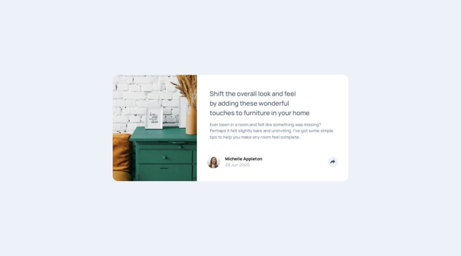
Design comparison
Solution retrospective
I am glad that I was able to making the interaction more enjoyable with CSS transitions, and also that I am beginning to understand accessibility better and how to make solutions more accessible. Next time I need to make sure that I consider the build out for both size designs before structuring the HTML, I had to make some large changes part way through to make the layout change correctly.
What challenges did you encounter, and how did you overcome them?I had some challenges with the layout of the footer between the open and closed sharebar, wanting to make sure the share bar position did not move to make it appear cleaner. I had to play around with the HTML structure and padding on different elements until the content was aligned on the card footer and the share bar.
What specific areas of your project would you like help with?I would greatly appreciate some help with two things:
-
The CSS transition is not working correctly on the live site, but it works fine in the dev environment with parcel and I don't know why. On the live site, the position of the share bar before being opened is defaulting to the wrong location, so the transition is starting from the wrong place. In the large layout, it should start just below where it appears, but instead is starting from the middle of the card. In the small layout, it should scale up from the share button location. I don't know why it only works in local, I have tried using both the scss and css file for the parcel dev environment and both work fine, until it is deployed.
-
When I use a screen reader it won't read out anything more than the level on heading of 'article preview component', and I'm not sure why as I think I have my HTML structured correctly. Any suggestions to improve accessibility would be great too.
Any help would be greatly appreciated thank you for looking at my solution!
Community feedback
- @burningbeattlePosted 6 months ago
Your HTML code is well-structured and incorporates good practices for accessibility and responsiveness. By addressing the minor issues and implementing the suggested improvements, you can enhance the user experience, accessibility, and performance of your component. Always remember to test your changes across different browsers and devices to ensure consistency and functionality.
0
Please log in to post a comment
Log in with GitHubJoin our Discord community
Join thousands of Frontend Mentor community members taking the challenges, sharing resources, helping each other, and chatting about all things front-end!
Join our Discord
