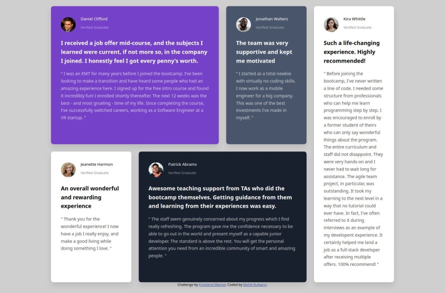
Testimonials-grid-section css grid section row column layouts
Design comparison
Solution retrospective
Most Proud Of:
Grid Layout and how it adapts to different screen sizes. Responsive Design with accurate styling and attention to detail. What I'd Do Differently:
Time Management: Improve task breakdown and time estimation. CSS Structure: Use a more modular approach (e.g., BEM) from the start. Earlier Cross-browser Testing to catch compatibility issues sooner.
What challenges did you encounter, and how did you overcome them?Grid Layout:
Challenge: Managing complex grid areas. Solution: Used grid-template-areas and media queries for responsiveness. Text Alignment:
Challenge: Aligning text and images consistently. Solution: Adjusted padding and margins for uniform spacing. Responsiveness:
Challenge: Ensuring consistent scaling across devices. Solution: Used relative units (rem, %) for flexible design.
What specific areas of your project would you like help with?Cross-browser Compatibility to ensure consistent display. Accessibility Improvements for better screen reader support. Performance Optimization like lazy loading and CSS refinement. CSS Architecture advice on structuring scalable CSS for larger projects.
Community feedback
- @zmora2622Posted 7 months ago
The container in which the cards are placed should be 1110px in size. I would start from that with the rest of the dimensions and layout. It looks different from the design, but it has its own charm :-). Read a little about html semantics, it is very useful. It is good to use relative units instead of absolute ones like rem or em in padding, margins and media.
0
Please log in to post a comment
Log in with GitHubJoin our Discord community
Join thousands of Frontend Mentor community members taking the challenges, sharing resources, helping each other, and chatting about all things front-end!
Join our Discord
