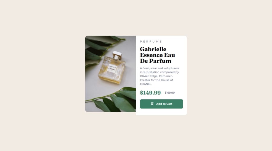
Design comparison
Solution retrospective
This project was the most accurated and attention to the details as much as i could.
What challenges did you encounter, and how did you overcome them?-It's how to position elements when use media queries.
-How to use width on main object properly
-How to set proper line-height for bigger font size
What specific areas of your project would you like help with?From the challenges so here were the problems
- I have a problem to figure out how to make equal width of the two sections equal. -I have tried to use flex-grow for each one and set flex-basis to 0 but it doesn't work. -The solution i've use, i don't think it's the best approach. -What's the best way to adjust width on the element according to my project. and should use rem or em. because no matter what it was inherit from their parent (in this case was html) -I saw the proper line-height settings here : https://www.joshwcomeau.com/css/custom-css-reset/ and i use this for my css rules
- { line-height: calc(1em + 0.5rem); }
But the line height of my h1 was overlap. so i adjust it manually after CSS reset. So i still don't clear how to use this rule properly.
Please log in to post a comment
Log in with GitHubCommunity feedback
- @burningbeattle
just a review done by chatgpt hence i am also nub in this hence reviewing code is more difficult than writing and understanding : ). all points are given by AI hence thanks for achieving the solution just similar to given
-
Removed unnecessary backslashes in @font-face declarations and recommended renaming font files to eliminate commas.
-
Ensured that class names in HTML and CSS match, especially after simplifying class names in the revised HTML.
-
Removed the invalid content: url() from .img-title and relied on the HTML <picture> element for responsive images.
-
Added word-wrap: break-word; and hyphens: auto; to .p__content to handle long words and improve text flow.
-
Changed the centering method from absolute positioning to Flexbox on the main container for better responsiveness and maintainability.
-
Added focus styles to the .btn--add-cart button and ensured semantic HTML by using a <button> element instead of an <a> tag.
-
Applied consistent BEM naming conventions across classes to enhance readability and maintainability.
-
Adjusted media queries to ensure elements scale appropriately on larger screens without relying on fixed widths.
-
Added box shadows, improved line heights, and added transition effects to enhance the visual appeal and user experience.
-
Added cursor: pointer; to buttons to indicate interactivity
By implementing these changes, your Product Preview Card Component will be more robust, accessible, and maintainable. Additionally, adhering to best practices in CSS will ensure that your component remains scalable and performs well across different devices and browsers.
Marked as helpful -
Join our Discord community
Join thousands of Frontend Mentor community members taking the challenges, sharing resources, helping each other, and chatting about all things front-end!
Join our Discord
