Javascript fundamentals Dom & event listners

Solution retrospective
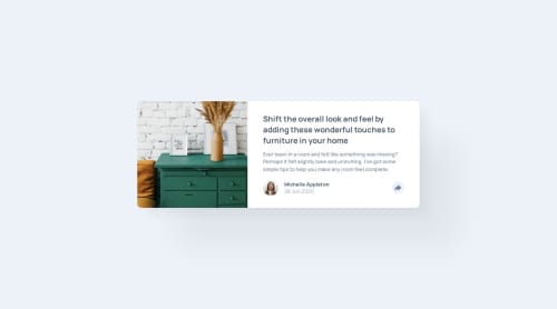
I’m most proud of successfully implementing the interactive share button feature using JavaScript. The share option is neatly integrated and displays only when the button is clicked, creating a clean and dynamic user experience. I would focus more on accessibility by ensuring better support for screen readers, adding ARIA attributes, and making sure the share option is keyboard-navigable. I might also explore more modern tools like CSS Grid for layout flexibility or CSS variables to allow users to easily change themes.
What challenges did you encounter, and how did you overcome them?I used CSS translate and scale to control the animation, making sure the share option is hidden until needed. Getting the correct toggle behavior on the share button required precise event handling. There was an initial challenge with the button not reverting to its inactive state after clicking. Solution: I resolved this by using the classList.toggle() method in JavaScript, ensuring smooth interaction by dynamically adding and removing the necessary classes.
What specific areas of your project would you like help with?I’d appreciate suggestions on improving the accessibility of the share option and the overall page for users relying on keyboard navigation and screen readers. Although the CSS transitions work well, any advice on optimizing animations for smoother performance, particularly on lower-end devices, would be valuable. Any recommendations on cleaning up or optimizing my CSS and JavaScript structure, especially in handling interactive elements, would be very helpful.
Please log in to post a comment
Log in with GitHubCommunity feedback
No feedback yet. Be the first to give feedback on Mohit kulkarni's solution.
Join our Discord community
Join thousands of Frontend Mentor community members taking the challenges, sharing resources, helping each other, and chatting about all things front-end!
Join our Discord