@justinvanreSubmitted over 1 year ago

Andre Ferreira
@Namonaki0All comments
- @Namonaki0Posted over 1 year ago
Hi Justin, well done for completing the challenge.
I found that the background image doesn't cover the entirety of the page and leaves a white gap on bigger screens. You could also try to centre the main container in mobile view. At the moment it sticks to the left.
I hope this helps a little bit.
Well done for the rest.
0 - @Shrija2Submitted over 1 year ago@Namonaki0Posted over 1 year ago
Hi SHRIJA2, well done for completing the challenge.
I've sent you a Pull Request with some changes that might help you achieve what you wanted. Don't need to merge it, it's just for reference and will hopefully be useful to you.
Basically what I've done:
- Simplified the CSS a little, mainly media-queries and selectors.
- Main tag introduced to encapsulate the whole content of the challenge and since it is the most important content it makes sense semantically.
- External div for each <section> has been removed as it didn't serve any particular purpose.
- Transitions and cursor: pointer on element hover/focus introduced for better UX.
- Skills score and images displayed dynamically making use of the json file provided.
I merely looked at code readability and structure. Pixel perfecting would still need to be looked at and design guidelines would still need to be followed.
Marked as helpful0 - @GIR0SANSubmitted over 1 year ago@Namonaki0Posted over 1 year ago
Hi Gilson, well done for completing the project.
Here are some points I came across when previewing your solution. This is not an extensive list.
- The burger menu is not visible in mobile view and there are some issues with image placement like you mentioned.
- When you shrink the viewport the content underneath tends to hinder the hero section and therefore conceal the down arrow of the project.
- Images and text don't follow the mobile design specified, not that big of a deal but will need better spacing at least to be more visually balanced.
- Client Testimonials section is also being superimposed and names are hidden in mobile view, they do show on bigger screens but there is no space between this section and the next.
If you like I can have a deeper look into your code and make some changes that might help you. I would explain every step as always. What I can do is clone your repo and then send you a PR when I'm finished. You won't need to merge it or anything but at least you can have a look at the differences. Let me know if this works for you.
Marked as helpful1 - @mary1308Submitted over 1 year ago@Namonaki0Posted over 1 year ago
Hi Mary, well done for completing the challenge.
I would suggest taking the mobile-first approach and work your way up - you can use min-width for your media-queries as breakpoints increase. That way it's easier to tackle responsiveness for different screen sizes. You are also using gap in different parts of your code and that's probably what's causing your issues with white spacing.
I hope this helps.
Marked as helpful1 - @LemidinkuSubmitted over 1 year ago@Namonaki0Posted over 1 year ago
Hi Lemi, well done for completing the challenge.
I sent you a PR for this repo - link here with a few suggestions.
In short:
- Submit button moved to inside the form - by norm JS will recognize a button inside a form as a submit button and it makes it easier to add an event listener to the form. In this case the "submit" event followed by a callback function.
- Aria-labels added to labels and description added to image alt attribute for accessibility reasons.
- Changed variable names to camel case in order to follow JS naming conventions.
- CSS variables introduced to make it easier for future changes. It's not that big of a deal for a small project like this but it's nice to know for when you start working on bigger ones and are able to change variables globally instead of several selectors. You can choose better names for these, they are just examples.
- Since you chose not to use the attribution bit of the code I decided to remove it.
- cursor: pointer and transition effects on hover and focus added to enhance UX.
- Default value added to selectedRating in case the user doesn't select a rating but submits the form anyway - it can be a choice.
- ES6 syntax used but not necessary - just requires less writing for the same outcome.
I've only focused on structure and readability but didn't do a thorough check, everything seems fine for the most part. Things like font size, etc would still need to be checked should you like to do it. These are just suggestions.
I hope this helps.
Marked as helpful1 - @anthonyplicataSubmitted over 1 year ago@Namonaki0Posted over 1 year ago
Hi Anthony, well done for completing the challenge. It looks really good.
Is Bootstrap an acceptable end all framework for a project in the professional space?- Yes, tonnes of sites use it every day, and many of them for commercial purposes. You just might want to check the comparison between various licenses. You can check some of these websites.You can also get rid of any code that's commented out if it's not serving any purpose, like the attribution bit before the Bootstrap CDN, along with the CSS that was left in the <head>
 .attribution { font-size: 11px; text-align: center; }
 .attribution a { color: hsl(228, 45%, 44%); }
You don't need to have different ids for each button. You can set the background-colour to transparent on hover which will then show the colour that's behind each one. I can see at the moment you have
background-color: hsl(0, 0%, 95%)for each individual button id -#sedan-button,#suv-button,#luxury-button. Try to adopt the DRY principle and have thebackground-color: hsl(0, 0%, 95%)andborder: 2px solid hsl(0, 0%, 95%)in the.buttoninstead.You can also style the h1s all at once without the need to have an id for each one of them -
#first, #second, #third.I hope this helps a little bit.
Marked as helpful1 - @CodingGenius14Submitted over 1 year ago@Namonaki0Posted over 1 year ago
Hi Vikram, not sure it's just me but the live URL is not working.
0 - @StevetheRebelSubmitted over 1 year ago@Namonaki0Posted over 1 year ago
Hi Steve, well done for completing the challenge.
Just a couple of observations.
You could use a
cursor: pointerfor when you hover a rating or the submit button. Also, if you select a rating and then click outside of it, the chosen number is automatically deselected but the component will still carry the previously selected rating. Likewise, if you chose not to select a rating from the get go and decide to submit anyway, the field will appear empty. These are more UX related considerations.I hope this helps.
Marked as helpful0 - @Netero03Submitted over 1 year ago@Namonaki0Posted over 1 year ago
Hi Jatin, nicely done.
Just a couple of things:
- The
.containerdiv could be turned into a <main> tag instead for semantic reasons, since it's the main section of the component. - You could add a default value of 0 to the
storedValuevariable in case the user doesn't select any rating, or perhaps add error handling in case this happens. You could also add acursor: pointerto each rating button for when they're being hovered or focused, it just adds to the UX overall.
Hope this helps.
Marked as helpful1 - The
- @IrusouSubmitted over 1 year ago@Namonaki0Posted over 1 year ago
Hi João, well done for completing the challenge.
At the moment the component is not adapting to mobile view. I would start developing for mobile first and then change the
media-queryto the next breakpoint, in this case 1440px. For the desktop view I would have both.score-headerandscore-summaryat 50% width to resemble the design a bit more. Also, if you'd like to add to the UX you could have acursor: pointerfor when you hover or focus the 'continue' button.I hope this helps a little bit.
Marked as helpful1 - @MartinXCVISubmitted over 1 year ago@Namonaki0Posted over 1 year ago
Hi Martin, well done for completing the challenge.
From a user experience perspective, it would be nice to be able to click on the dropdown in its entirety and not just when you hover the small arrow. Also, at the moment you cannot navigate the component using the keyboard and that can be an issue when it comes to accessibility. To solve this try looking into the tabindex attribute.
I hope this helps a little bit.
Marked as helpful0 - @iamcelestinoSubmitted over 1 year ago@Namonaki0Posted over 1 year ago
Hi Celestino, well done for completing the challenge.
Just one small detail, I would consider increasing the value of your min-width, perhaps to the next design breakpoint 1440px. I would use a max-width for the main container in order to avoid it expanding too wide when the window is resized from mobile view. I hope this makes sense.
Thanks.
Marked as helpful0 - @EAguayodevSubmitted over 1 year ago
Results Summary Component using HTML and CSS with flexbox techniques.
#node#webflow#styled-components@Namonaki0Posted over 1 year agoHi Eric, well done for completing the challenge.
1 - I did a Lighthouse audit and you scored 96. That's mainly because your heading is not in sequentially-descending order, meaning, you started with a h3 heading and since there is no h1 and h2 present in the page you were marked for that. Also, the main div that wraps the whole component would probably be best if it was a <main> tag for semantic reasons.
2 - I used LT Browser to check your solution in different devices and browsers. It seems to work fine. Just one detail, at least for desktop view you could center the component in the middle of the page. You can achieve this by doing:
body {
   display: grid;
   height: 100vh;
   place-content: center;
}
3 - JSON is just an object that contains some data. You can use the fetch method to get access to what's inside that object in form of a promise.
This might help in the future:
I hope this answers your questions a little bit at least.
Marked as helpful0 - @0xabdulkhaliqSubmitted over 1 year ago@Namonaki0Posted over 1 year ago
Hi Adbul, it looks impressive.
Just one thing, like mentioned before the content is superimposing itself on the bottom of the page (desktop design) - talking about
main__headlineandmain__recommended. Looking at it from a glance it looks like if you remove thegrid-templateand you define theheightasmax-contentinstead, then add amargin-bottomto themain__headlineit should fix the issue.Maybe by now you're already working on it.
Hope this helps.
Marked as helpful1 - @dialmonsalveSubmitted over 1 year ago@Namonaki0Posted over 1 year ago
Hi DIEGO,
This seems to be a totally different project.
Perhaps a mistake?
Thanks, Andre
0 - @tanveerrakiblSubmitted over 1 year ago@Namonaki0Posted over 1 year ago
Hi TANVEER, well done for completing the challenge.
A few points I would like to mention:
Instead of having a div with a class of main you could have the <main> tag and make that the main wrapper.
You can center it in the middle of the page with the below:
main {
  display: grid;
  height: 100vh;
  place-content: center;
}
I can see that you haven't included any media queries which would make your design responsive. I would use the mobile-first approach and then work my way up by using a media-query with a min-width for a chosen breakpoint, most likely 1440px as specified.
Just a few points to consider. I hope this helps.
Marked as helpful0 - @Alone-Y154Submitted over 1 year ago@Namonaki0Posted over 1 year ago
Hi YASHWANTH, well done for completing the challenge.
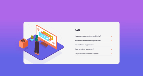
One thing you could do is add some logic in JS for when you click on a dropdown. At the moment if you open every single dropdown the whole content will overflow the main container. Perhaps, when you click on a dropdown the one that was previously open would automatically close avoiding this issue. You can also decrease the font size of the hidden content, that will help you achieve this.
Also, you could center the main container in mobile view to make it look more uniform.
I hope this helps a little bit.
Marked as helpful0 - @carolalvesdevSubmitted over 1 year ago@Namonaki0Posted over 1 year ago
Oi Ana, parabens por ter completado o projecto.
Para ficar com a componente no meio da pagina pode fazer o seguinte:
.container {
   display: grid;
   height: 100vh;
   place-content: center;
}
Fica bem.
Marked as helpful1