Submitted over 1 year ago
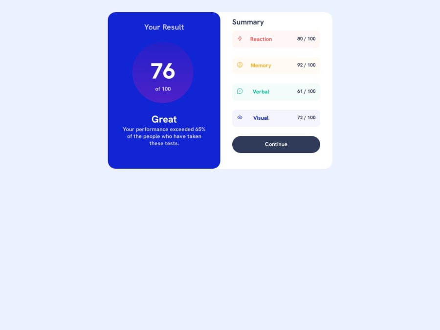
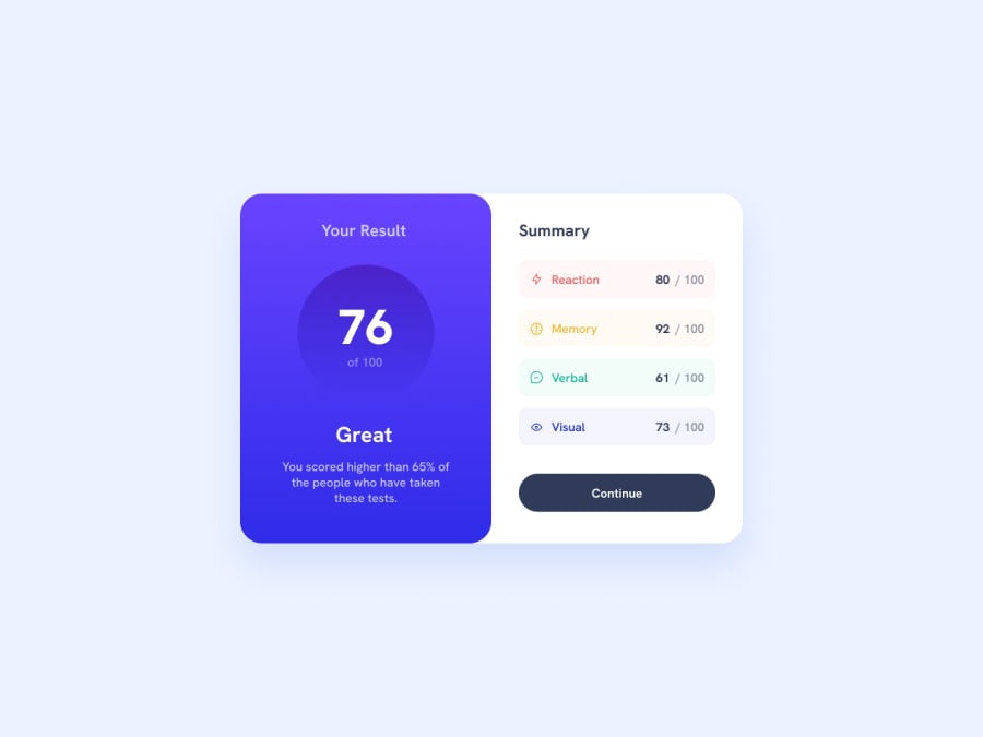
Results Summary Component using HTML and CSS with flexbox techniques.
#node#webflow#styled-components
@EAguayodev
Design comparison
SolutionDesign
Solution retrospective
Hey frontend mentor community!! It's been a long time since doing a challenge here on the platform, however, I do have some questions to leave here and for feedback on the challenge itself.
- Does the code do well with meeting accessibility guidelines?
- Does my solution come across as consistent on multiple browsers with regards to my design meeting the details needed to be achieved?
- I skipped doing the bonus challenge, but am also open to knowing if there's a certain level of javascript to understand before being able to understand JSON?
Community feedback
Please log in to post a comment
Log in with GitHubJoin our Discord community
Join thousands of Frontend Mentor community members taking the challenges, sharing resources, helping each other, and chatting about all things front-end!
Join our Discord
