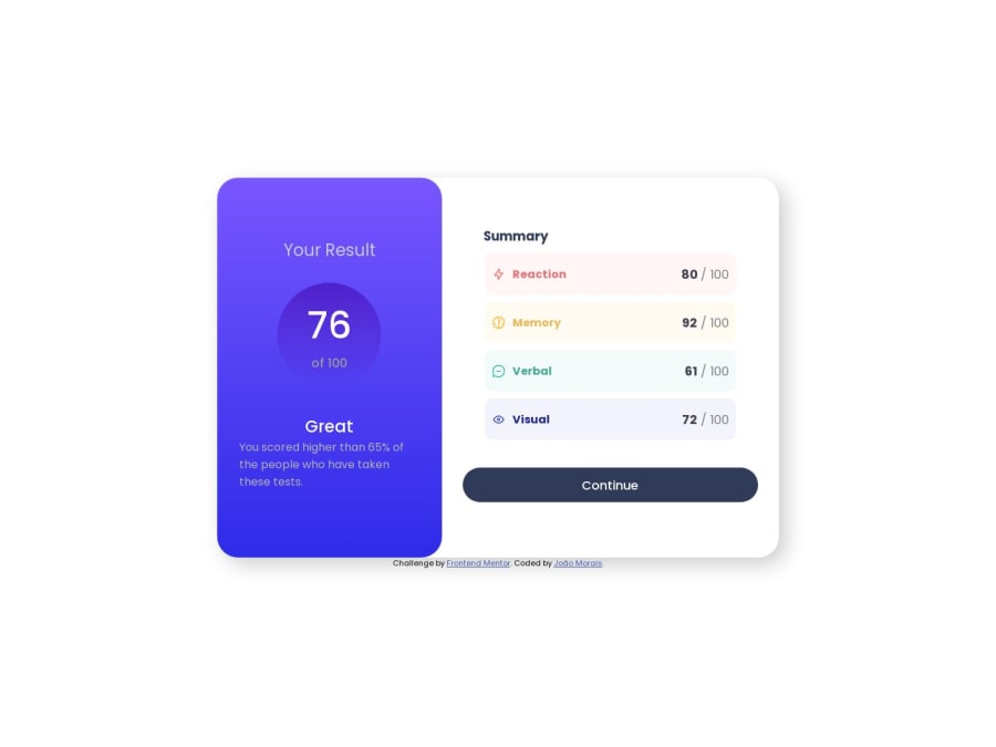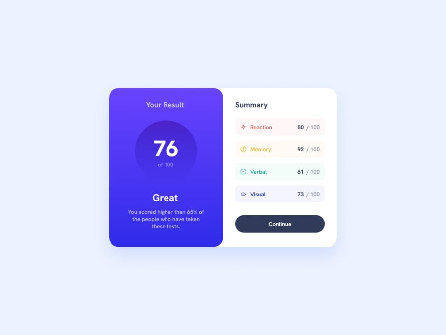
Design comparison
Solution retrospective
Still learning about gradients and hsl. I'm open to critics so i can learn and do better :D
Community feedback
- @Namonaki0Posted over 1 year ago
Hi João, well done for completing the challenge.
At the moment the component is not adapting to mobile view. I would start developing for mobile first and then change the
media-queryto the next breakpoint, in this case 1440px. For the desktop view I would have both.score-headerandscore-summaryat 50% width to resemble the design a bit more. Also, if you'd like to add to the UX you could have acursor: pointerfor when you hover or focus the 'continue' button.I hope this helps a little bit.
Marked as helpful1
Please log in to post a comment
Log in with GitHubJoin our Discord community
Join thousands of Frontend Mentor community members taking the challenges, sharing resources, helping each other, and chatting about all things front-end!
Join our Discord
