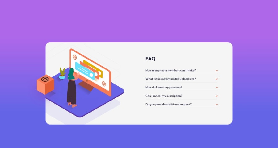
Multiple Breakpoints FAQ Accordion Card
Design comparison
Solution retrospective
Advices are welcome!
Community feedback
- @Namonaki0Posted over 1 year ago
Hi Martin, well done for completing the challenge.
From a user experience perspective, it would be nice to be able to click on the dropdown in its entirety and not just when you hover the small arrow. Also, at the moment you cannot navigate the component using the keyboard and that can be an issue when it comes to accessibility. To solve this try looking into the tabindex attribute.
I hope this helps a little bit.
Marked as helpful0@MartinXCVIPosted over 1 year agoHi Andre, thank you! I'll be checking it out and modifying it. 🙏🏻 @Namonaki0
1
Please log in to post a comment
Log in with GitHubJoin our Discord community
Join thousands of Frontend Mentor community members taking the challenges, sharing resources, helping each other, and chatting about all things front-end!
Join our Discord
