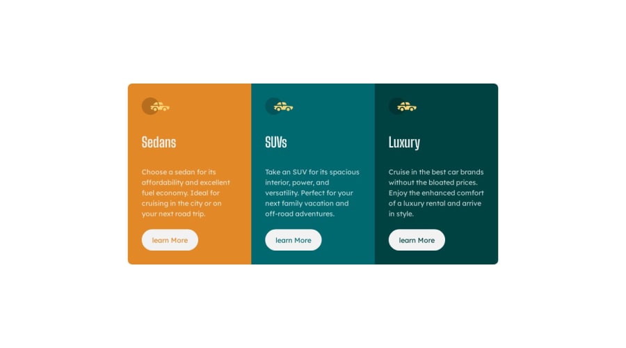
Design comparison
Solution retrospective
any suggestions on how to improve are welcome.
Community feedback
- @Namonaki0Posted over 1 year ago
Hi Celestino, well done for completing the challenge.
Just one small detail, I would consider increasing the value of your min-width, perhaps to the next design breakpoint 1440px. I would use a max-width for the main container in order to avoid it expanding too wide when the window is resized from mobile view. I hope this makes sense.
Thanks.
Marked as helpful0@iamcelestinoPosted over 1 year agoThanks, I'll try to make some changes. @Namonaki0
1
Please log in to post a comment
Log in with GitHubJoin our Discord community
Join thousands of Frontend Mentor community members taking the challenges, sharing resources, helping each other, and chatting about all things front-end!
Join our Discord
