Not Found
Not Found
Not Found
Not Found
Not Found
Not Found
Not Found
Not Found
Not Found
Not Found
Not Found
Not Found
Not Found
Not Found
Not Found
Not Found
Not Found
Not Found
Not Found
Not Found

All comments

  • @jcgoodwin86

    Submitted

    What are you most proud of, and what would you do differently next time?

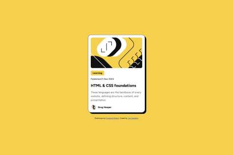
    I didn't need a media query for the card size to make it responsive.

    @Fikerte-T

    Posted

    hi @jcgoodwin86

    Great solution !! 🎉 🎉 Code is well-structured and layout is responsive on a range of screen sizes.

    You can still work on your solution to look similar to the design perhaps by adjusting the height of your card.😊

    Good job and keep going 👏

    0
  • Eloisa8 10

    @Eloisa8

    Submitted

    What are you most proud of, and what would you do differently next time?

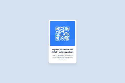
    I am proud to be able to finish this content in one sit, and I will enjoy it next time.

    What challenges did you encounter, and how did you overcome them?

    Challenges that I encounter was Change PX to rem. Upload my code to GitHub.

    What specific areas of your project would you like help with?

    Any feedback would be greatly appreciated.

    @Fikerte-T

    Posted

    @Eloisa8 great solution!! Its well-structured and readable. No considerable difference from the design. Your UI looks good on most of screen sizes. However, the image gets unresponsive for smaller screen sizes (screen sizes less than 300px). So instead of this

    .codigo{
     max-width: 19.2rem;
     margin: 1.067rem 1.067rem 1.6rem 1.067rem;
     border-radius: 10px;
    }
    

    You can add a fixed width to be a percentage of the container and a height set to auto. This helps to scale up and down your image with different screen sizes.

    .codigo{
        width: 90%;
        max-width: 19.2rem;
        height: auto;
        margin: 1.067rem 1.067rem 1.6rem 1.067rem;
    }
    

    Hope you find this comment helpful Good job!!

    0