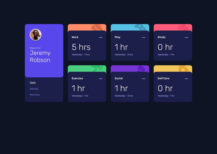
Design comparison
Solution retrospective
It was an interesting refactoring process how my js-file grew. From a rather hardcoded time-tracking-element to a mostly dynamic one.
💡I will take a break more often in the future while coding, it seems useful to me...
What challenges did you encounter, and how did you overcome them?It is always an exciting question for me how to structure the html appropriately. And also how to deal with accessibility correctly.
In this case, these links were a help to me.
What specific areas of your project would you like help with?About any other ideas on accessibility and html-structure I am pleased to find out.
Community feedback
- @Fikerte-TPosted 5 months ago
hi @MarenOelixtown Your solution looks amazing. You did a great job. Just few things to improve it 😊😊 Removing the margin for larger screen size in your main
margin: 10rem auto;and then addingdisplay: flex; justify-content: center; alight-items: center;to the body will position your grid at the center both vertically and horizontally.
Great job!! happy coding 😊😊😊
Marked as helpful0@MarenOelixtownPosted 5 months agoMany thanks @Fikerte-T for the hint ... I'll have a look right away👍
0
Please log in to post a comment
Log in with GitHubJoin our Discord community
Join thousands of Frontend Mentor community members taking the challenges, sharing resources, helping each other, and chatting about all things front-end!
Join our Discord
