Design comparison
SolutionDesign
Solution retrospective
What are you most proud of, and what would you do differently next time?
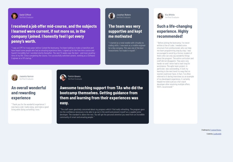
I think I got the design pretty close to what was given.
What challenges did you encounter, and how did you overcome them?It was tricky to get the sizes of the grid items correct but then I remembered the grid-row and grid-column properties.
Community feedback
- @Fikerte-TPosted 6 months ago
hey @CoolNight99 You did a really good job!! congratulations!!! I see a few things than can be improved
- use lower important heading like h2 and h3 instead of h1 as it is a simple page that doesn't serve a main heading
- include everything in
main - use
justify-content: center;on grid-container class (for smaller screen) so that your cards can be centered. - Keep the order of the cards as they appear in the design and use
grid-column-start,grid-column-end,grid-row-start,grid-row-endas needed to rearrange the cards. Because this is the main lesson here about using grids.
I hope this helps Happy coding
1
Please log in to post a comment
Log in with GitHubJoin our Discord community
Join thousands of Frontend Mentor community members taking the challenges, sharing resources, helping each other, and chatting about all things front-end!
Join our Discord
