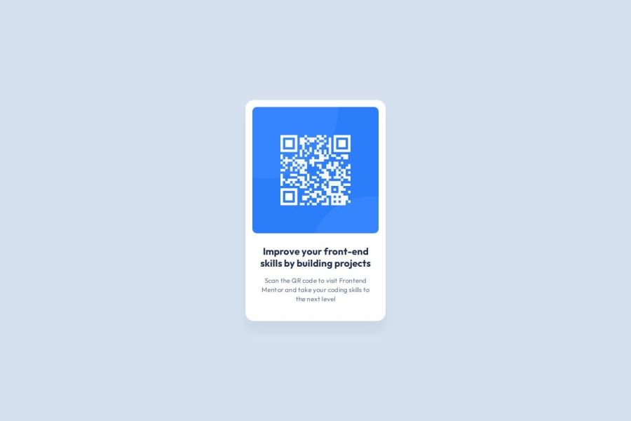
Design comparison
Solution retrospective
I am proud to be able to finish this content in one sit, and I will enjoy it next time.
What challenges did you encounter, and how did you overcome them?Challenges that I encounter was Change PX to rem. Upload my code to GitHub.
What specific areas of your project would you like help with?Any feedback would be greatly appreciated.
Community feedback
- @Fikerte-TPosted 7 months ago
@Eloisa8 great solution!! Its well-structured and readable. No considerable difference from the design. Your UI looks good on most of screen sizes. However, the image gets unresponsive for smaller screen sizes (screen sizes less than 300px). So instead of this
.codigo{
 max-width: 19.2rem;
 margin: 1.067rem 1.067rem 1.6rem 1.067rem;
 border-radius: 10px;
}
You can add a fixed width to be a percentage of the container and a height set to
auto. This helps to scale up and down your image with different screen sizes..codigo{ width: 90%; max-width: 19.2rem; height: auto; margin: 1.067rem 1.067rem 1.6rem 1.067rem; }Hope you find this comment helpful Good job!!
0
Please log in to post a comment
Log in with GitHubJoin our Discord community
Join thousands of Frontend Mentor community members taking the challenges, sharing resources, helping each other, and chatting about all things front-end!
Join our Discord
