Not Found
Not Found
Not Found
Not Found
Not Found
Not Found
Not Found
Not Found
Not Found
Not Found
Not Found
Not Found
Not Found
Not Found
Not Found
Not Found
Not Found
Not Found
Not Found
Not Found

All comments

  • P
    yinnie 260

    @wcyin9

    Submitted

    What are you most proud of, and what would you do differently next time?

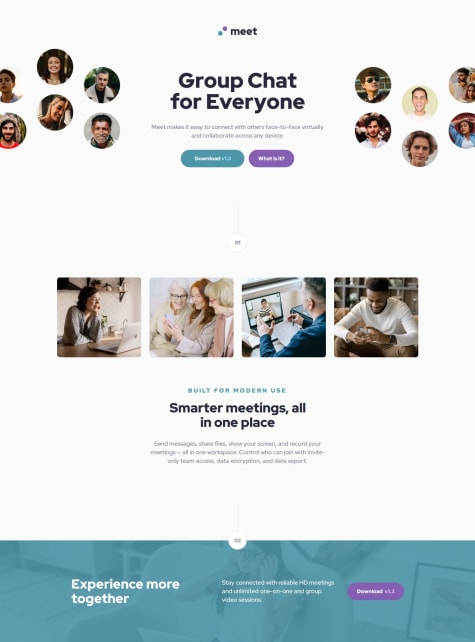
    I did a mobile first approach where I used flexbox for everything except the 4 images under 01, which was done with grid. My reasoning for this was that I imagined flexbox to be more suitable for the main layout than grid. For example, flexbox with the desktop hero image and description was easily achievable, where I used order to put the two images on both ends, and the text in the middle.

    Next time I might try grid. Please let me know if you think grid is better for this layout, and why.

    What challenges did you encounter, and how did you overcome them?

    The most challenge I went through was figuring out how to code out the footer image with the blue overlay. I solved it by using picture and source elements in html rather than css background-image (for responsive reasons), and adding a background-color in css for the footer selector.

    I also had a bit of trouble planning out how to code the hero image for the desktop view, but I solved it by using display: none;

    What specific areas of your project would you like help with?

    Please let me know if grid was a better choice for this challenge.

    In addition, I feel like my media query may have a lot of redundancy. If there's better ways to code responsive sizing, please let me know. If there's any other area where I could use more work on or I should change, please let me know as well. Thanks for your time!

    M 920

    @Dev-MV6

    Posted

    Hi there 👋, great job on completing the challenge; your solution looks really good.

    Regarding your question about whether it's better to use Grid instead of Flexbox for the general layout of the site, I'd say the way you approached it this time is totally valid and appropriate for this specific case. You could have also used Grid if you wanted, and it would have been totally okay as well; I think you can choose the one you feel more comfortable working with.

    Personally, I don't like to use Grid when building simple layouts because Grid layouts usually require more configuration to achieve the same level of responsiveness and flexibility that Flexbox offers you by default (saving you some lines of code). So, I tend to leave Grid for more complex layouts.

    I hope you find this helpful. Please let me know if you have any further questions; I'd be more than happy to help.

    Marked as helpful

    0
  • Kyureus 160

    @Kyureus1

    Submitted

    when you inmediately click on the button after the advice shows up on the screen, it flashes and shows the same advice, it takes like a 2 or 3 seconds delay to show a new one, if you click on the button during these time, it will not change. I couldn't find out how to help that, i want the request to be faster and smoother. i will be checking some other solutions to see if i can do it.

    my responsive advice generator app

    #cube-css#node#styled-components#web-components#svelte

    2

    M 920

    @Dev-MV6

    Posted

    Just in case you need it in the future...

    You can control HTTP cache with the Cache-Control header:

    • Using the Fetch API:
    fetch(url, { method: "GET", cache: "no-cache" });
    

    You should give this article a read, it will give you a better understanding of how HTTP caching works: https://developer.mozilla.org/en-US/docs/Web/HTTP/Caching

    Marked as helpful

    1
  • Kyureus 160

    @Kyureus1

    Submitted

    What are you most proud of, and what would you do differently next time?

    only thing i'm proud of is the styles switching thing. there's another project i made where i had to do a lot of useless things to switch styles when the best solution was simply setting a button to change the href in when you click in it. It was a simple thing, but saddly i didn't find out before. ``

    What challenges did you encounter, and how did you overcome them?

    i didn't finish the border countries part, because i couldn't find out how. I thinked that maybe it was in the API but i think it wasn't ¿do you have any solution for that or do i have to do it by myself?

    responsive country-info app

    #accessibility#node#solid-js

    1

    M 920

    @Dev-MV6

    Posted

    Hi there 👋, good job on completing the challenge.

    The information about the borders is provided by the Rest Countries API, there's a field called borders that you can request just like you did with the rest:

    https://gitlab.com/restcountries/restcountries/-/blob/master/FIELDS.md

    Now, I suggest you make a single request to the API instead of multiple for each field:

    • Instead of all these calls
    fetch(`${API_URL}/all?fields=name`);
    fetch(`${API_URL}/all?fields=population`);
    fetch(`${API_URL}/all?fields=region`);
    fetch(`${API_URL}/all?fields=capital`);
    
    • Just make one call and include all the fields you need
    fetch(`${API_URL}/all?fields=flags,name,population,region,subregion,capital,tld,currencies,languages,borders,independent`);
    

    This has a huge impact in your app's performance, let me give you an example:

    const fields = 'flags,name,population,region,subregion,capital,tld,currencies,languages,borders,independent';
    const url = `https://restcountries.com/v3.1/all?fields=${fields}`;
    
    async function fetchData() {
      const res = await fetch(url);
      const countries = await res.json();
    
      // And now you can simply access the properties you need, without having to make any extra requests
      countries.forEach(country => {
        console.log(country.name, country.borders);
      })
    }
    
    fetchData();
    

    Also, as you might have noticed, you should not use Promise.then() inside an async function, that's what the await keyword is for. You can read more about the proper use of async functions in this article:

    https://developer.mozilla.org/en-US/docs/Web/JavaScript/Reference/Statements/async_function

    Remember you can also use the local data.json that comes with the challenge and fetch the data from there instead of using the API.

    Hope you find this helpful 👍

    Marked as helpful

    1
  • Eunila 50

    @Eunila

    Submitted

    What are you most proud of, and what would you do differently next time?

    I like to learn new things ,so if i mistake something of my code feel free to write feedback .i will be more happy for your feedback

    M 920

    @Dev-MV6

    Posted

    Hi there 👋, congrats on completing this challenge, you did an excellent job. Your solution looks great.

    Just one small suggestion. You can use the position property to position your .attribution element absolutely so it doesn't take up any space:

    .attribution {
      /* padding: 80px 50px 0px; */
      /* margin: 80px 50px 0px; */
      position: absolute;
      bottom: 40px;
    }
    

    https://developer.mozilla.org/en-US/docs/Web/CSS/position#absolute_positioning

    Overall your solution looks really good. I hope you find this helpful, let me know if you have any questions, I'll be happy to help 👍

    0
  • @Netodev-dfz

    Submitted

    What are you most proud of, and what would you do differently next time?

    Me orgulho que aprendi maneiras novas para abranger e melhorar meu código.

    What challenges did you encounter, and how did you overcome them?

    Os desafios foram como iniciar o projeto, a centralização, a separação de cada coisa no seu devido lugar.

    What specific areas of your project would you like help with?

    Parte do display flex, com a centralização dos itens.

    QrCode

    #accessibility#bootstrap

    1

    M 920

    @Dev-MV6

    Posted

    Hi there, you can apply the following styles to your body to center the card:

    body {
      min-height: 100vh;
      display: flex;
      justify-content: center;
      align-items: center;
    }
    

    Hope you find this helpful 👍

    0
  • @erratic-enigma

    Submitted

    What are you most proud of, and what would you do differently next time?

    This is my first time experimenting with container queries, though I only used them for applying border-radius on the image when the main element reaches certain minimum widths:

    @container (width >= 42.875em /* 686px */) {
      border-radius: …
    }
    

    Interested to take advantage of them on larger projects in the future.

    What challenges did you encounter, and how did you overcome them?

    On small viewports, the image fits across the full width of the page, but the rest of the content has whitespace on both sides. I didn't want to use an extra wrapper with padding applied around the content. Instead, I made use of grid with the following columns:

    grid-template-columns: [gutter-start] minmax(auto, 1.75rem) [content-start] 1fr [content-end] minmax(auto, minmax(auto, 1.75rem) [gutter-end];
    

    positioned all the content inside of the content column:

    main > * { grid-column: content; }
    

    then positioned the image across all available columns:

    .opening-image { grid-column: gutter; }
    

    What specific areas of your project would you like help with?

    I'm not entirely sure if I structured the markup for the table properly, so any pointers on that would be nice.

    I'm also not sure about the way I applied positioning styles to the ul and ol elements. Are there any better methods than using margin and padding?

    Recipe Page

    #sass/scss#vite

    1

    M 920

    @Dev-MV6

    Posted

    Hi there 👋, congratulations on solving this challenge, your solution looks great.

    I think you are using the table element correctly, remember you can always explore different ways to get the same result using CSS and Flexbox, in any case, don't worry about the table. The way you approached it is completely valid.

    Now, using margin to set the spacing between the list items is completely valid as well. In fact, I think it is the most common way. If you are curious about alternative ways to set the spacing between the items in a list, Flexbox has you covered:

    .list {
      display: flex; /* enable Flexbox in the container */
      flex-direction: column; /* position children elements in a column */
      gap: 0.5rem; /* the space you want between the children elements */
    }
    

    You can read more about Flexbox in this article: https://css-tricks.com/snippets/css/a-guide-to-flexbox/

    Hope you find this helpful 👍

    Marked as helpful

    1
  • @MyatThihaNaing-mthn

    Submitted

    What are you most proud of, and what would you do differently next time?

    I can now build project without watching tutorial.

    What challenges did you encounter, and how did you overcome them?

    There were a few challenges which I cannot override the global css with tailwind classes.

    What specific areas of your project would you like help with?

    I would like to know best practices of tailwind css. In my project, I felt I made spaghetti css.

    M 920

    @Dev-MV6

    Posted

    Hi there 👋, congrats on solving this challenge.

    You might want to check this out from the Tailwind's official documentation, it will teach you ways you can manipulate Tailwind for the specific needs of your projects:

    https://tailwindcss.com/docs/adding-custom-styles

    Hope you find this helpful 👍

    Marked as helpful

    1
  • @okonks

    Submitted

    What are you most proud of, and what would you do differently next time?

    I'm most proud of the significant amount of new skills I acquired while tackling this challenge. Despite working at a slower pace, I found immense satisfaction in the knowledge gained throughout the process. Additionally, mastering responsive layouts was a notable achievement for me. Looking ahead, I aim to optimize my workflow to enhance productivity and efficiency in future projects.

    What challenges did you encounter, and how did you overcome them?

    I encountered challenges while implementing responsive layouts, but I found valuable guidance from resources like W3Schools and ChatGPT. Additionally, achieving equal spacing between divs proved challenging, but I resolved it by utilizing the justify-content: space-between property. These experiences underscored the importance of seeking assistance from reliable sources and experimenting with different CSS properties to overcome obstacles effectively.

    What specific areas of your project would you like help with?

    I need help changing the color of the image to match exactly with the project's color scheme. I've conducted my own research, but I couldn't achieve the desired result of matching the color of the image precisely with the project's color scheme.

    @Grego14 and many others🙏🙏🙏

    M 920

    @Dev-MV6

    Posted

    Hi there 👋, good job on completing this challenge.

    If you want to improve the final result, you can simply reduce the opacity of the image to 0.75, this will make it match perfectly with the design:

    #right-side img {
      mix-blend-mode: multiply;
      opacity: 0.75;
    }
    

    Hope you find this helpful 👍

    0
  • P
    yinnie 260

    @wcyin9

    Submitted

    What are you most proud of, and what would you do differently next time?

    I had a lot of fun with this one. I think I'll revisit this challenge next time using CSS frameworks.

    What challenges did you encounter, and how did you overcome them?

    I struggled a bit getting the grid to work correctly. If you look at the bottom of the card on the very right, the height of it is slightly off from the other cards. I think it has something to do with the amount of rows/columns I made.

    What specific areas of your project would you like help with?

    Please let me know if there's any mistakes I made, or if there's better code I can implement.

    M 920

    @Dev-MV6

    Posted

    Hi there 👋, your solution looks great.

    The reason your element with the .card5 class-name doesn't seem to be aligned correctly with the rest of the cards on the bottom of the grid is because you've set the max-height property to the element, restricting its maximum height to 572px.

    To solve this, simply tweak the value you've set for this property on your style-sheet:

    @media (min-width: 1110px) {
      .card5 {
        /* max-height: 572px; */
        max-height: 577px;
      }
    }
    

    Hope you find this helpful 👍

    Marked as helpful

    0
  • Covenant-0 100

    @Covenant-0

    Submitted

    What are you most proud of, and what would you do differently next time?

    I am proud I finally completed this challenge completing this challenge. It took me a number of days.

    What challenges did you encounter, and how did you overcome them?

    The only challenge i faced was how to display different images on different screen sizes. I made a lot of research and i was finally able to do it. I learnt new things. The snippet below is an example of what i learnt. (```

                ```)
    

    What specific areas of your project would you like help with?

    I need help with importing fonts from the google fonts website. I made a lot of research and tried a lot of things but the font did not reflect in the code. If there's anyway i can go about this or any alternative, kindly let me know in the comments below. Thanks

    Product Preview Page

    #accessibility

    2

    M 920

    @Dev-MV6

    Posted

    Hi there 👋, importing the fonts using the link tag in your HTML is not enough to apply the font family to your page. You need to set the CSS font-family property to the element you want apply the font to in your style-sheet:

    h1 {
      font-family: Fraunces, serif;
    }
    

    Hope you find this helpful 👍

    Marked as helpful

    0
  • @Abhishek10351

    Submitted

    What specific areas of your project would you like help with?

    I would like help on the two background svgs and how to add them in the desing as intended.

    M 920

    @Dev-MV6

    Posted

    Hi there 👋

    Getting the background right can be the most difficult part in this challenge, here's one way you can achieve a very close result to the original design, with the help of the background-position property and CSS media queries to make it responsive:

    /* Mobile first */
    body {
      background-position: left -330px top -300px, right -428px bottom -326px;
      background-size: 540px, 640px;
    }
    
    @media (min-width: 700px) {
      /* Medium size screens */
      body {
        background-position: left -585px top -510px, right -530px bottom -633px;
        background-size: 978px;
      }
    }
    
    @media (min-width: 1300px) {
      /* Large size screens */
      body {
        background-position: left -285px top -510px, right -230px bottom -633px;
      }
    }
    

    Hope you find this helpful 👍

    0
  • P
    Ortaly 970

    @ortalyarts

    Submitted

    What are you most proud of, and what would you do differently next time?

    Features:

    • Vanilla Javascript + Native CSS + Semantic HTML5.
    • Responsive design + Mobile first approach.
    • Form validation.
    • Accessibility.
    • Customised accessible drop down select element.
    • Countdown to launch date (for presentation purpose: the date is set to 30 days in the future from the moment the user visits the website).

    What specific areas of your project would you like help with?

    Accessibility question: I've spotted a bug: if I navigate through the site with the keyboard (using tab key), after arriving to the select element I can't go further or go back to other inputs. So to move back or forth I have to use the mouse... Any suggestions on how to fix this issue are highly appreciated!

    Any other suggestions for improvement are also very welcome :)

    M 920

    @Dev-MV6

    Posted

    Hi there 👋

    The reason you are unable to change the tab focus when it reaches the drop-down menu is that you are you using the Event.preventDefault method in your handleKeyPress function which instructs the browser to not execute the default action for that event.

    In your case, you are telling the browser to prevent any default action when the keydown event is triggered on the target element, and the default action in this particular case is to change the tab focus, that's why when you press the Tab key, the focus gets stuck on the drop-down menu.

    Hope you find this helpful 👍

    Marked as helpful

    0
  • @5alidev

    Submitted

    What are you most proud of, and what would you do differently next time?

    I'm proud that I completed this project in a short amount of time and independently. What I would do differently next time is to create a separate file for the styling (CSS).

    What challenges did you encounter, and how did you overcome them?

    I didn't encounter any challenges during this project.

    What specific areas of your project would you like help with?

    I would like help in how to minimize the HTML.

    M 920

    @Dev-MV6

    Posted

    Hi there, good job on completing this challenge.

    Is not a good practice to write your CSS using style tags inside your HTML, instead you can create a file in same directory and call it style.css, then use a link tag inside your head tag to reference that file. This is way you are separating the page structure from the style-sheet:

    <link href="style.css" rel="stylesheet">
    

    Hope you find this helpful 👍

    0
  • John 410

    @MiyaoCat

    Submitted

    What are you most proud of, and what would you do differently next time?

    Next time I'll do a bit more planning. I ran into some trouble between screen sizes and how the elements would move in relation to the screen width.

    What challenges did you encounter, and how did you overcome them?

    I especially had trouble with the inputs, specifically the blue text inside the input boxes.

    It took me 3 iterations to nail.

    First - I tried adding the text using the :after pseudo-class then using position: absolute. I try to stay way from using position absolute as much as possible, but this was the first thing that came to mind. I positioned the text so it fit inside the input box, but as soon as I changed the screen width the text would move. This clearly would not be suitable.

    Second - I looked at some real world forms that have some sort of image or text inside the input. I came across Nike.com and saw that they had a wrap around the input and the text/image. This actually worked, for the most part. I had something like this:


                  cm
                
    
    ```. I then added all of the CSS like hover and focus to the wrap. But one thing that I didn't really like was when I'd tab from one 'input-wrap' to the next input, it would require the user to press tab twice to get to the actually input field (once for the wrap then a second tab to get into the input). I figured I could get away with this, but it wasn't a great experience.
    
    This led me to my final solution. Instead of wrapping the input and text in a separate div, I used the label to wrap the div. The only unfortunate part about this solution is that the label doesn't have any text inside it. However, this solved the tab issue. Now you can easily tab between inputs. 
    
    I also struggled with the Limitation cards (Gender, Age, Race, etc). I knew I had to use grid, but I didn't set it up right initially. I had all of the cards wrapped in a div and the div wrapper had a grid. This worked for mobile and tablet, but not for desktop as the sub-header and text didn't play well with that design. All I had to do was remove the wrapper.
    
    ### What specific areas of your project would you like help with?
    I'd like to have a JSON file with all the different "ideal" weights for each height. I started working on it,  but I didn't get it up and running. I created the JSON file with the data, but need to pull it into the webpage.
    
    M 920

    @Dev-MV6

    Posted

    Hi there 👋, good job on completing the challenge.

    I came across your solution and decided to write a function to give you an idea of how you can achieve what you want to do with the ideal weight ranges. First of all, I think you definitely have to find a better way to store the weight ranges in your data.json, here's one way you can do it:

    {
      "100": { "min": 13.9, "max": 21.9 },
      "110": { "min": 14.3, "max": 23.3 },
      "120": { "min": 15.0, "max": 24.8 },
      "130": { "min": 15.7, "max": 26.2 },
      "140": { "min": 16.5, "max": 27.7 },
      "150": { "min": 17.4, "max": 29.2 },
      "160": { "min": 18.5, "max": 31.0 },
      "170": { "min": 19.6, "max": 32.8 },
      "180": { "min": 20.8, "max": 34.7 },
      "190": { "min": 22.1, "max": 36.6 },
      "200": { "min": 23.5, "max": 38.6 },
      "210": { "min": 24.9, "max": 40.7 },
      "220": { "min": 26.5, "max": 42.9 },
      "230": { "min": 28.1, "max": 45.3 },
      "240": { "min": 29.9, "max": 47.7 },
      "250": "out of range"
    }


    And here's the function to fetch and consume the data:

    let idealWeights
    function getIdealWeight(userHeight) {
      if (!idealWeights) {
        // Fetch data
        fetch("data.json")
          .then((response) => {
            if (!response.ok) throw new Error("Unable to get ideal weight: And error occured while fetching the data")
            return response.json()
          })
          .then((data) => {
            idealWeights = data
            getIdealWeight(userHeight)
          })
      } else {
        // Use fetched data
        const heightRangeKey = Object.keys(idealWeights) // Get all keys from object
          .sort((a, b) => parseInt(b) - parseInt(a)) // Sort heights
          .find((height) => parseInt(height) <= userHeight) // Find matching height
    
        const idealWeightRange = idealWeights[heightRangeKey]
    
        if (!idealWeightRange || idealWeightRange === "out of range") {
          throw new Error("Unable to get ideal weight: Given height is out of range")
        }
    
        return idealWeightRange
      }
    }
    
    console.log(getIdealWeight(180))
    

    This is might not be the best solution for your problem but at least I hope it can give some hints for you to come up with something better. Good luck!

    Hope you find this helpful 👍

    0
  • @tatsuya98

    Submitted

    What are you most proud of, and what would you do differently next time?

    nothing

    What challenges did you encounter, and how did you overcome them?

    nothing since it was similar to the qr code

    What specific areas of your project would you like help with?

    making it more responsive so that it shrinks when going below 400px

    M 920

    @Dev-MV6

    Posted

    Hi there 👋, congrats on completing this challenge.

    You can simply update the following styles in your CSS to get the result you are looking for:

    .container {
      max-width: 400px;
    }
    
    li {
      /* width: 35ch; */
      width: 100%;
    }
    

    Hope you find this helpful 👍

    Marked as helpful

    0
  • @KatherineMarlo

    Submitted

    What are you most proud of, and what would you do differently next time?

    I am the most proud of configuring the responsive layout.

    What challenges did you encounter, and how did you overcome them?

    Major challenges until I realized that I closed my content wrapper div too early and it was causing major problems with the layout. I was really frustrated until I figured out what was going on.

    What specific areas of your project would you like help with?

    Please help me understand why I cannot seem to get the border-radius to work on the content wrapper div and anything else!

    M 920

    @Dev-MV6

    Posted

    Hi Katherine 👋, congrats on completing this challenge!

    The reason you are not seeing any visual changes when you set the border-radius property to the main container is that when you set a border-radius to a container and its children have a background, that background overflows the parent element's box. Therefore, what you end up seeing are the corners of the children elements' box.

    To solve this, you can simply add the CSS overflow property with a value of hidden to your .content-wrapper. This will instruct the browser to hide any overflow in the box of the element:

    .content-wrapper {
      overflow: hidden;
    }
    

    I hope you find this useful 👍

    Marked as helpful

    1
  • @mendesdomingosdev

    Submitted

    What are you most proud of, and what would you do differently next time?

    I'm proud that I could even make it.🤣

    What challenges did you encounter, and how did you overcome them?

    Dealing with media query, but it's not that hard actually ig.

    What specific areas of your project would you like help with?

    My css file looks a mess, how can I make it more clear for like someone who is working with me in a project?

    Blog Preview Card

    #accessibility

    2

    M 920

    @Dev-MV6

    Posted

    Hi there, good job on completing the challenge.

    Code readability is essential in collaborative environments. One piece of advice I can give you to improve is to start using more descriptive names for your classes.

    This will help you when working on larger projects where the style sheets are much longer. If you develop the habit of using descriptive class names for your elements, you won't get lost if you ever need to scale your code, and it will certainly help other developers understand it more easily.

    For example, instead of using class-names like container, content, author, try to think of the element you are styling as a component and the elements inside that element (children elements) as parts of that component.

    This way,

    • Instead of .container, you can use .card for the main container, now it's a component
    • Since .content is part of the .card component you can use .card-content
    • .author would be .card-author
    • Instead of using .text h1 to select the card title you can assign a class like .card-content__title to the h1 element an use it as selector in your CSS

    Don't get frustrated if you struggle with finding the best descriptive class name for your elements at first, you'll better at that with time.

    Another thing you can do to improve your code readability is to write your CSS selectors from top to bottom, in hierarchical order so the parent elements of the component go first, and the sibling elements just like they are positioned in the HTML tree.

    For example, in your code the .box should go before the .author selector because the .box element is positioned before the .author element in the card.

    Hope you find this helpful 👍

    Marked as helpful

    2
  • Renata 170

    @An-Renata

    Submitted

    It was good practice to strengthen my React skills, although I encountered a problem with the search button click. With React I didn't know how to implement the button click and read the value from the input field, I just implemented it to listen for a keyPress "Enter".

    Maybe someone could guide me how to implement and solve this issue. :)

    M 920

    @Dev-MV6

    Posted

    You can use the onClick event handler on the search button. You just need to refactor the SearchBar component and use a single function to handle both events.

    Here's a refactored version of your SearchBar component:

    import { useRef } from "react";
    
    function SearchBar({ setSearchValue }) {
      const searchBoxRef = useRef(null);
    
      function onSearchValue() {
        const searchBox = searchBoxRef.current;
        setSearchValue(searchBox.value);
        // Clear input box after searching
        searchBox.value = "";
      }
    
      return (
        <div>
          <input
    	ref={searchBoxRef}
    	type="text"
            placeholder="Search for any IP address or domain"
            onKeyDown={e => e.key === "Enter" ? onSearchValue() : null}
          ></input>
          <span>
            <button className="search-btn" onClick={onSearchValue}>&gt;</button>
          </span>
        </div>
      );
    }
    
    export default SearchBar;
    

    Don't forget to pass the setSearchValue callback to the component:

    <SearchBar setSearchValue={ setSearchValue } />
    

    You can read more about onClick and useRef in the React documentation:

    Hope you find this helpful 👍

    Marked as helpful

    0
  • Dáša 20

    @DasaGott

    Submitted

    Hi,

    I've finished the FAQ form. It was fun, but I really struggled with positioning of the images. I decided to position them as absolute and adjusted distance manually, but I feel like that is not a very good approach. Do you have any other suggestions how could I position them?

    Thanks a lot

    M 920

    @Dev-MV6

    Posted

    Congratulations on completing your first challenge. I'd say your approach to positioning the elements on the page is not that uncommon and not a bad practice at all, as it makes total sense to position the image relative to the parent container. So, don't worry about it. One suggestion I have for you is to apply the following styles to the .questions-wrapper element in order to make the page more responsive to smaller screen sizes:

    @media only screen and (max-width: 675px) {
      .questions-wrapper {
        width: 100%;
        height: min-content;
      }
    }
    

    Hope you find this helpful! 👋

    Marked as helpful

    0
  • @AkamineFabio

    Submitted

    I didn't put the 'X' (close icon) in the right place on mobile size, I'm looking for an alternative option to make the design more accurate with the original one. I don't know how to do this 'wavy border effect' in the winning player and I don't know how to search for it, so if you know how to do it, please let me know! I used SASS to practice a little. I will study more to use the tool properly, like doing more mixings for example.

    M 920

    @Dev-MV6

    Posted

    You can make the spotlight effect for the winner coin by using radial-gradient() as the background of a pseudo-element, here's an example:

    .coin {
      position: absolute;
      left: 50%;
      top: 50%;
      transform: translate(-50%, -50%);
      width: 200px;
      height: 200px;
      background-color: #f00;
      border-radius: 100%;
      z-index: 1;
    }
    
    .coin::after {
      content: '';
      position: absolute;
      top: 50%;
      left: 50%;
      height: 260%;
      width: 260%;
      background: 
        radial-gradient(circle,
          hsla(0,0%,100%,.08) 40%,
          hsla(0,0%,100%,.04) 40%,
          hsla(0,0%,100%,.04) 55%,
          hsla(0,0%,100%,.02) 55%
        );
      border-radius: 100%;
      transform: translate(-50%,-50%);
      transform-origin: 0 0; /* Useful when animating with scale() */ 
      z-index: -1;  
    }
    

    You can learn more about hard stop gradients on: https://css-tricks.com/books/greatest-css-tricks/hard-stop-gradients/

    Hope you find this useful 👍

    Marked as helpful

    1
  • @ebeeraheem

    Submitted

    HELP NEEDED

    This is my least problematic challenge so far. I was able to markup the page with much ease. The only issues I have are:

    • Difficulty trying to set the opacity. I wasn't sure whether opacity was the right property to use as I'm currently not aware of other methods of setting the overlay. Please do let me know if there are other methods.
    • I had some difficulty trying to set the size of the text and the image to be equal (I'm still not sure whether they are equal). How can I set the left-col and right-col to be equal in size?
    M 920

    @Dev-MV6

    Posted

    • Using the opacity property to create the tinted effect for the image is not a bad practice, so don't worry about it. In case you want to try a different approach next time, remember that the background property also allows you to achieve the same effect if you use it like this:
    .right-col {
      background:
        linear-gradient(
          rgba(170, 92, 219, 0.6),
          rgba(170, 92, 219, 0.6)
        ),
        url("images/image-header-desktop.jpg") center / cover no-repeat;
    }
    
    • And regarding to the containers' size... if I'm not wrong, in the original design the containers of the text and the image don't have the same width, so in my opinion you don't need to change anything.

    Overall your solution looks great. Good job 👍

    Marked as helpful

    1
  • M 920

    @Dev-MV6

    Posted

    If you look carefully, the card background is not a solid color but a radial gradient of two colors. However, it seems like they forgot to include the second color in the style guide. You can use an eyedropper tool over the design image to get an approximation of the original color.

    To get a more accurate result, use the following style:

    main {
      background: radial-gradient(circle at top, hsl(213, 19%, 18%), #161d27);
    }
    

    Hope you find this helpful. 👋

    0
  • @covolan

    Submitted

    Hi Frontend Mentor community 👋

    This is my solution on the interactive rating component. Overall I had a really good time giving the page some style and animation. The JS part was challenging and fun to deal with. I believe that the JS part could be smaller, perhaps using jquery, any tips regarding the script or the CSS part?

    Thanks in advance for the feedback and the tips!😄

    M 920

    @Dev-MV6

    Posted

    Hi there, there are several things you can modify to improve your code:

    • In order to avoid repeated code when selecting elements from the DOM, use JavaScript loops or combine Document.querySelectorAll and Array.forEach methods, for example:

      Instead of doing this ❌

      const btn1 = document.getElementById("1")
      const btn2 = document.getElementById("2")
      const btn3 = document.getElementById("3")
      const btn4 = document.getElementById("4")
      const btn5 = document.getElementById("5")
      
      btn1.addEventListener("click", () => console.log("Button 1 clicked!"))
      btn2.addEventListener("click", () => console.log("Button 2 clicked!"))
      btn3.addEventListener("click", () => console.log("Button 3 clicked!"))
      btn4.addEventListener("click", () => console.log("Button 4 clicked!"))
      btn5.addEventListener("click", () => console.log("Button 5 clicked!"))
      

      Do it like this ✅

      // Select all the elements in the DOM with the "clickable-button" class
      const buttons = document.querySelectorAll(".clickable-button")
      
      buttons.forEach((button) => {
        // The following will be executed for each item of the 'buttons' array
        button.addEventListener('click', () => {
          console.log(`Button ${button.id} clicked!`)
        })
      })
      
    • Always use className instead of id: If multiple elements share the same functionality or style, it's better to use a common class name instead of individual IDs.

    • Use more descriptive names for your variables; this will help you a lot in the future to not get lost in bigger projects and collaborative environments where code readability is key.

    • Avoid modifying CSS styles with JavaScript directly, instead assign the styles you want to a class name in your stylesheet and toggle the class using JavaScript:

      Do not change style properties with Javascript directly ❌

      btn.style.backgroundColor = 'hsl(25, 97%, 53%)'
      btn.style.color = 'white'
      

      Assign the styles to a class name in your stylesheet ✅

      /* Normal state */
      .rating-button {
        background-color: hsla(212, 20%, 37%, 0.26);
        color: hsl(217, 12%, 63%);
      }
      
      /* Selected state */
      .rating-button--selected {
        background-color: hsl(25, 97%, 53%);
        color: #fff; /* white color in hexadecimal (avoid using color names) */
      }
      

      Whenever you need to apply/remove the styles to an element you just have to add/remove the class rating-button from the element like this:

      // Add the class with the styles
      btn.classList.add("rating-button--selected")
      
      // Remove the class with the styles
      btn.classList.remove("rating-button--selected")
      

    Finally, here's a simplified and optimized version of your script (I left some variable names without changing so you don't get confused but remember to use more descriptive names for your variables in the future):

    // Variable to track the currently selected button
    let selectedRatingButton
    // Select all elements in the document with the `rating-button` class
    const ratingButtons = document.querySelectorAll(".rating-button")
    // Add event listeners
    ratingButtons.forEach(btn => {
      btn.addEventListener('click', (event) => {
        handleRatingButtonClick(event)
      })
    
      // You can also pass the function directly as argument to the addEventListener method like this:
      // btn.addEventListener('click', handleRatingButtonClick)
    })
    
    function handleRatingButtonClick(event) {
      const clickedButton = event.target // Get clicked button from the event object
      if (selectedRatingButton === clickedButton) { 
        // if clicked button is the currently selected button
        return // Do nothing
      } else {
        // Remove styles from the currently selected button if defined
        selectedRatingButton?.classList.remove("rating-button--selected")
        clickedButton.classList.add("rating-button--selected") // Add styles to the new button
        selectedRatingButton = clickedButton // Store as currently selected button
      }
    }
    
    // Submit form
    const form = document.getElementById("form")
    const number = document.getElementById("number")
    const rating = document.getElementById("rating-state")
    const thank = document.getElementById("thank-state")
    
    form.addEventListener("submit", (event) => {
      event.preventDefault()
      rating.style.display = "none"
      thank.style.display = "flex"
      if (selectedRatingButton) {
        number.innerText = selectedRatingButton.innerText
      } else {
        // No rating selected
        number.innerText = "0"
      }
    })
    

    I really hope you find this information helpful. Good luck! 👍

    Marked as helpful

    2
  • @Ahmadhassan0

    Submitted

    I tried everything to change SVG image size but none of them is working, I also changed the width="48" and height="48" in SVG tag but it's also not working

    <svg xmlns="http://www.w3.org/2000/svg" width="48" height="48">
                <g fill="none" fill-rule="evenodd">
                  <circle cx="24" cy="24" r="24" fill="#DFE6FB" />
                  <path fill="#717FA6" fill-rule="nonzero"
                    d="M32.574 15.198a.81.81 0 00-.646-.19L20.581 16.63a.81.81 0 00-.696.803V26.934a3.232 3.232 0 00-1.632-.44A3.257 3.257 0 0015 29.747 3.257 3.257 0 0018.253 33a3.257 3.257 0 003.253-3.253v-8.37l9.726-1.39v5.327a3.232 3.232 0 00-1.631-.441 3.257 3.257 0 00-3.254 3.253 3.257 3.257 0 003.254 3.253 3.257 3.257 0 003.253-3.253V15.81a.81.81 0 00-.28-.613z" />
                </g>
              </svg>
    

    Can you tell me how I can change the size?

    M 920

    @Dev-MV6

    Posted

    Remember you can also experiment with transform: scale() to resize SVG elements.

    Marked as helpful

    1