
@rowanroosterSubmitted 9 months ago
Latest solutions
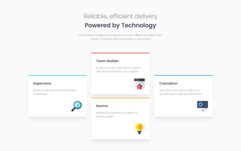
four card feature section
Submitted 9 months agoKindly help me to take a look at this project and check whether its in need of any correctioms. Thanks.
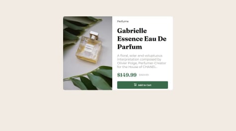
Product Preview Page
#accessibilitySubmitted 12 months agoI need help with importing fonts from the google fonts website. I made a lot of research and tried a lot of things but the font did not reflect in the code. If there's anyway i can go about this or any alternative, kindly let me know in the comments below. Thanks
Blog preview card using HTML and CSS
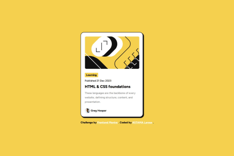
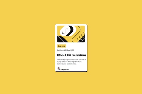
#accessibilitySubmitted 12 months agoAt the bottom of the flyer, I need help putting the image and the name Greg Hooper side by side. That should be all I need help with. But if you see any other issues, kindly notify me. Thank you
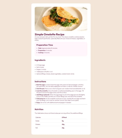
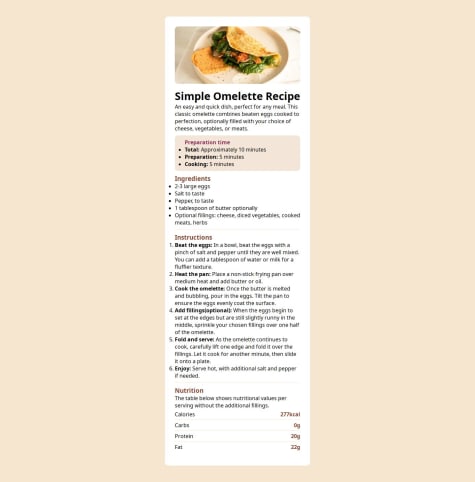
Recipe Page
#accessibility#sass/scss#tailwind-cssSubmitted about 1 year agoIf there's any errors kindly bring it to my notice so as to make it better.
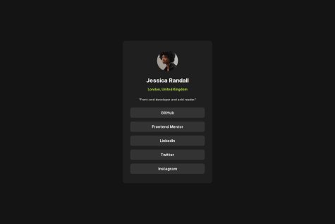
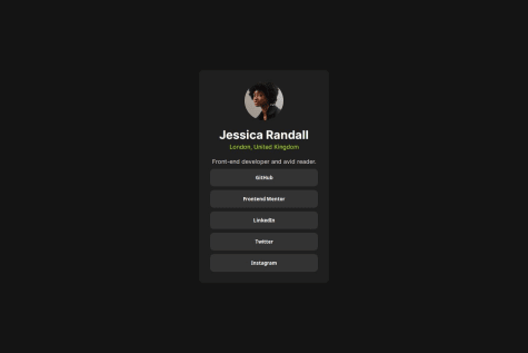
Social links profile using HTML and CSS
#accessibilitySubmitted about 1 year agoNone at the moment. But if you by chance notice that I skipped something kindly do well to notify me.
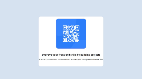
QR code component challenge using HTML and CSS
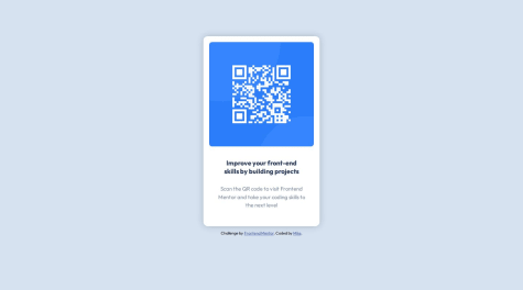
#accessibilitySubmitted about 1 year agoAsides from the positioning, None at the moment.
Latest comments
- @mateo1627Submitted 12 months ago
- P@yoe7501Submitted 12 months agoWhat are you most proud of, and what would you do differently next time?
I like that I got to make use of a grid layout and figured out how to make lines seperating thet content using background color.
What challenges did you encounter, and how did you overcome them?I had a hard time making the card a certain size no matter how big the window was but figured it out at the end.
What specific areas of your project would you like help with?I would like a good amount of styling tips to make this project easier and some css syntax tips to potentially have less lines of code next time.
@Covenant-0Posted 12 months agoTo start with, you did a great job with this project. However, you are to try to replicate the given design as close as possible. The only issue i see with this code is the font-color. The main font color is black but you used dark raspberry throughout the body of the code. Asides from that, i think your code is perfect.
0 - @banhmisg9509Submitted 12 months ago
- P@ikitamalaroseSubmitted 12 months agoWhat are you most proud of, and what would you do differently next time?
I was able to do this challenge in less time than my first challenge. I was able to learn the notion of transitions and create an animation. As for responsive design, i no longer have a problem with the understanding of the latter.
What challenges did you encounter, and how did you overcome them?About animation
What specific areas of your project would you like help with?Currently i don't have any specific requests
@Covenant-0Posted 12 months agoHello there, great job on completing this challenge. Kudos to you. I went through your github repository and the styling was great. Keep up the good work.
0 - @sanyomor-01Submitted about 1 year agoWhat are you most proud of, and what would you do differently next time?
I'm proud of designing this component
What challenges did you encounter, and how did you overcome them?I didn't encounter any challenge
What specific areas of your project would you like help with?I'm good
@Covenant-0Posted about 1 year agoThe design and positioning of this project is great, however, you'll need to add a margin-top if you want it to look as close to the problem given as possible which is our aim. Asides from that, the project looks very good.
Marked as helpful0