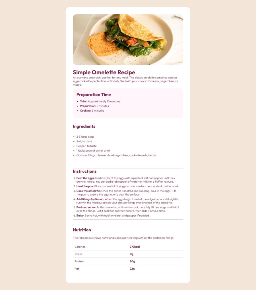
Design comparison
Solution retrospective
I like that I got to make use of a grid layout and figured out how to make lines seperating thet content using background color.
What challenges did you encounter, and how did you overcome them?I had a hard time making the card a certain size no matter how big the window was but figured it out at the end.
What specific areas of your project would you like help with?I would like a good amount of styling tips to make this project easier and some css syntax tips to potentially have less lines of code next time.
Community feedback
- @Emoji123-sPosted 12 months ago
Hi @yoe7501, amazing work with the project. Upon previewing the webpage, it is accessible, but the font-color of the entire page elements is the same. Color references were provided in the style-guide.md in the project folder, so you can check that out to fix the colors to match the design template. The mobile view looks good, and responsive too, but it doesn't match the mobile design template, and the margins for the image seem to be a lot when moved to the mobile. Basically, the container is supposed to span the entire page for the mobile view, and the image should lose its margins and span the top, while responding to changes in screen sizes.
With these changes, your project will be much more like the design. Have fun! 😉
Marked as helpful0 - @Covenant-0Posted 12 months ago
To start with, you did a great job with this project. However, you are to try to replicate the given design as close as possible. The only issue i see with this code is the font-color. The main font color is black but you used dark raspberry throughout the body of the code. Asides from that, i think your code is perfect.
0
Please log in to post a comment
Log in with GitHubJoin our Discord community
Join thousands of Frontend Mentor community members taking the challenges, sharing resources, helping each other, and chatting about all things front-end!
Join our Discord
